When I say this month tried my patience, IT. TRIED. IT. Leading up to the thesis, was the most anxiety-provoking experiences I’ve had…since I wrote my last thesis in 2017…*don’t judge* school and I have a love-hate relationship. It really is hard to believe a year has passed and I am only a few short weeks away from accomplishing another goal I’ve set for myself.
This month has added new experiences to my skill set and helped me push passed some of my long-term fears. In this course, we worked toward drafting our thesis presentation based on the four desired learning outcomes (DLOs): Connecting, Synthesizing, and Transforming; Solving Problems; Innovative Thinking; and Acquired Competencies. I also built my own Wix site detailing how my projects show mastery of the DLOs and created a Behance profile to showcase my process developing the BoxPark Sushi design strategy. With all of this done, there are a few things I have taken away from this month.
1st. You can never know everything, but with Google you sure can find out a lot
The first two weeks were spent building up our DLO abstracts that would serve as the foundation of our persuasive argument for mastery. Writing four mini papers justifying and supporting a year’s worth of design decisions with references requires a lot of information that I did not have. Thankfully, Google (and a long browser history) helped me find old sources that I had forgotten to write down or find better ones when the original could not be located. Writing the abstracts reminded me that it is important to keep up with the details that support our decisions so that we can confidently relay the information to clients and show our idea has merit. While my peer review reminded me to break up run-on sentences. Using Google helped find support sources for design decisions made almost a year ago.
My husband often jokes that there’s no reason people shouldn’t know things because it takes as much time to Google it as it does to say “I don’t know”. When it came time to design layout options for our Wix site, I was stumped. Although I’ve completed freeCodeCamp’s Responsive Web Design cert and am working on the Front-End Web Development track through Treehouse, I didn’t really know how to properly design a website layout. So I Googled it! My eyes were opened to the world of website layouts and white space.
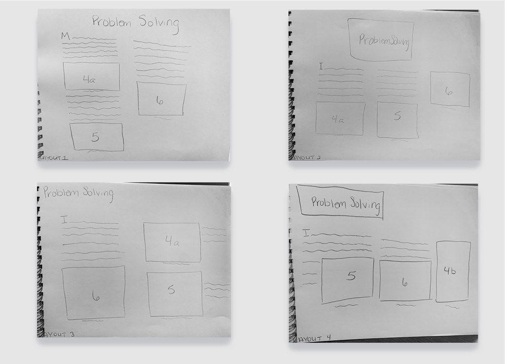
Needless to say, I used the wonderful sources from my best friend, Google, to create multiple drafts of layouts for my Wix site. I wanted to keep the information to be as neat as possible so I decided that going with a column grid would create a cleaner look and minimize paragraphs running across the screen. However, I needed to come up with four layout designs PER DLO so I had my “Google” cut out for me (stick around, it gets punnier).
As a student entering into the job market, I will not know everything there is to know. I will be tempted to portray that perfect employee persona to avoid admitting that I actually have imposter syndrome… That’s it. There’s no major resolution. I’m just glad I’ll have my new husband, Google, to get me through it.
2nd. Having a centralized location for my work is paramount as a future graduate
Starting out with this month, I was worried about having to create a Wix site and a Behance portfolio. I’ve been on Behance for almost a year and the work is amazing, so I was definitely intimidated to think I had to put a project up, as well. Of course, having pu the project up, I feel like a major hurdle has been cleared and I’m proud of myself for completing the task.
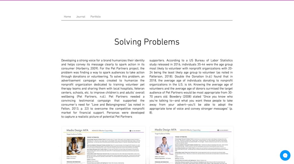
The Wix site was meant to work as a presentation for our thesis to live. We gathered all the information we used to support our design decisions (remember Google? this is where that comes in handy) and displayed them on our site. While I went through several drafts of my site layout, I ultimately ended up with a layout that is clean and showcases the material well. To look at the rest of my layout choices, click here!
Completing the Behance project also helped create a location for future projects to be housed. While I could have done this on my own time, having a time crunch definitely helped give me the push to actually put something on the site and made it a lot less intimidating. Being able to showcase things I’ve worked on is going to be important for my future, especially if I end up working as a contractor. Moving forward, I will need to continue uploading projects and working through my experiences so that I can overcome feeling like an imposter. To check out my Behance project, click here!
3rd. The Rule of Thirds is life (see what I did there?!)
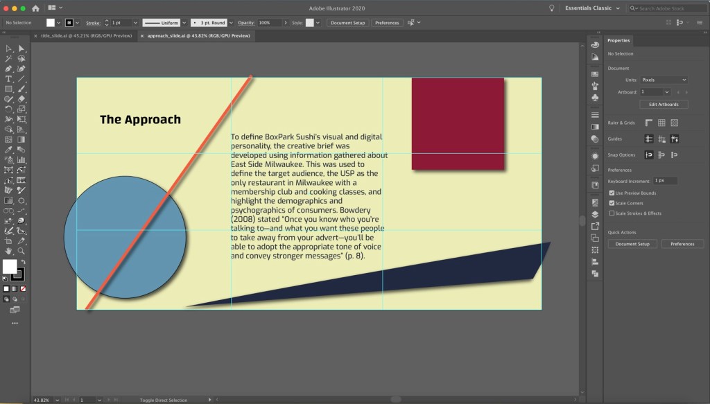
Last, but definitely not least, the Rule of Thirds is a lifesaver. I struggled a lot with placement and spacing during this process. Introducing the Rule of Thirds helped me focus on how I place objects in relation to one another. Aligning objects to the four points of the intersecting line can create a more balanced and pleasing layout (Hampton-Smith, 2018; Reid, 2017). Now that I have a better understanding of how to utilize the Rule of Thirds, I can incorporate it in future designs to improve my layouts, reduce crowding, and explore unique spacing that heighten my work.
Moving Forward
But I’m not done yet. I still have another class before i’m done!
References:
Hampton-Smith, S. (2018, September 26). How to create balanced page layouts. Creative Bloq. https://www.creativebloq.com/netmag/create-balanced-page-layouts-7-pro-tips-121310009
Reid, M. (2017). The 5 rules of design composition and layout. 99designs. https://99designs.com/blog/tips/design-composition-and-layout/

One thought on “Month 11: Presentation of Design Solutions”