Blog Feed

Month 12: Professional Practice

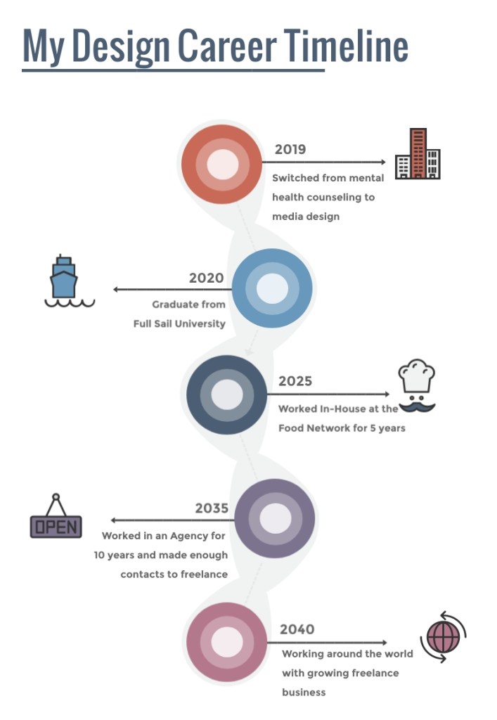
When I say, I am tired…However, I could not be more proud of myself for finishing this program. A year ago, I thought I would never be able to find something I was passionate about. I was jealous of people who seemed to just love what they did. I didn’t know how to find my way. It has definitely been a roller coaster of thoughts and feelings, filled with numerous assignments. This may be my last blog post for this program, but it is my goal not let it be my last EVER blog post. So, a quick recap of the last year.

Overview of the material and concepts learned this YEAR

Semester 1

Month 1: Mastery: Personal Development and Leadership

Personal triumph of the month: I received the Course Director Award

My projected course timeline

While this month consisted mostly of readings and discussion posts, it was a smooth entry into the program. It gave me a chance to to really dig deep and think about how I learn and how that can effect my designs. I was also able to identify personal goals for the program and specify my intentions. Reading Robert Greene’s (2012) Mastery helped open my eyes to the ways in which I can approach this career change such as using the Darwinian Strategy to “occupy the perfect niche” (p. 30).

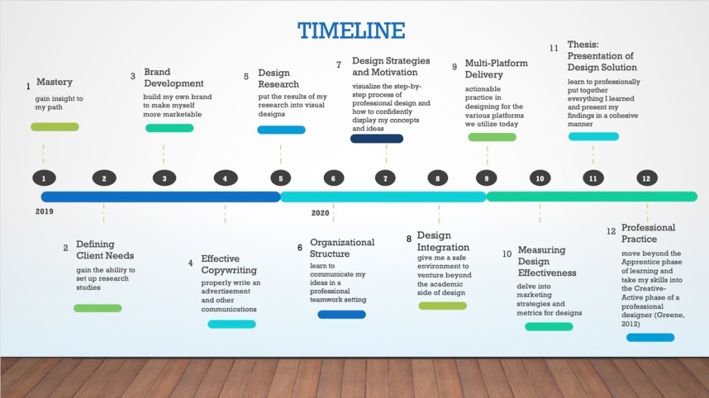
When it came to the thesis, I did not have any particular materials that lent to the degree learning outcomes (DLOs: connecting, synthesizing, and transforming; problem solving; innovative thinking; acquired competencies) we were trying to address. However, my work all stemmed from Greene’s (2012) Darwinian Strategy. While I am still understanding my overall style as a designer, it was my goal to use the skills I learn in this program to identify the perfect niche for me. Creating my program timeline, helped layout small goals I can accomplish during my time at Full Sail. While I did not do everything I intended to do while in the program, I can say that having the timeline to look back on helped me stay focused and grounded. Through more projects and practice I will find a way to utilize the enlightening information I realized about myself in this course.

Month 2: Defining Client Needs

Personal triumph of the month: Created my first logo concepts

Example of the Traditions mind map and final logo iterations

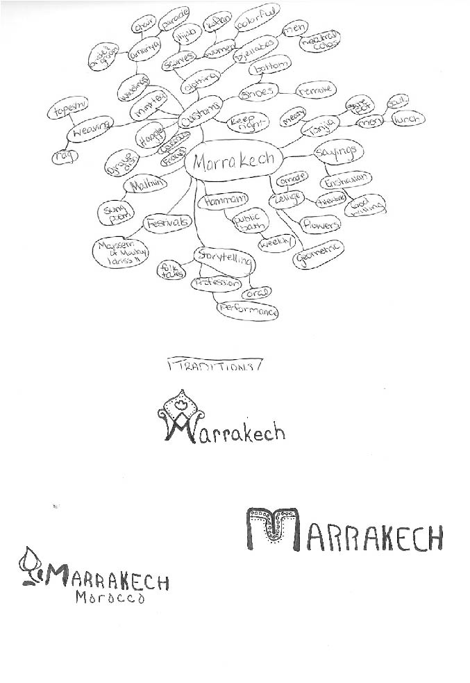
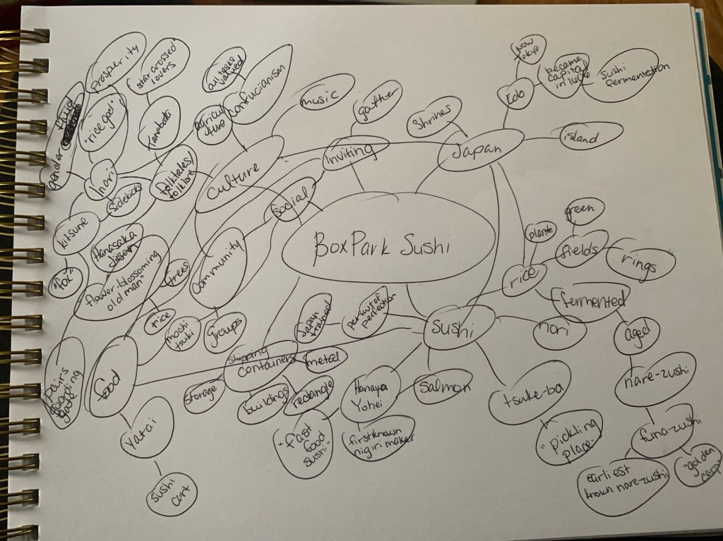
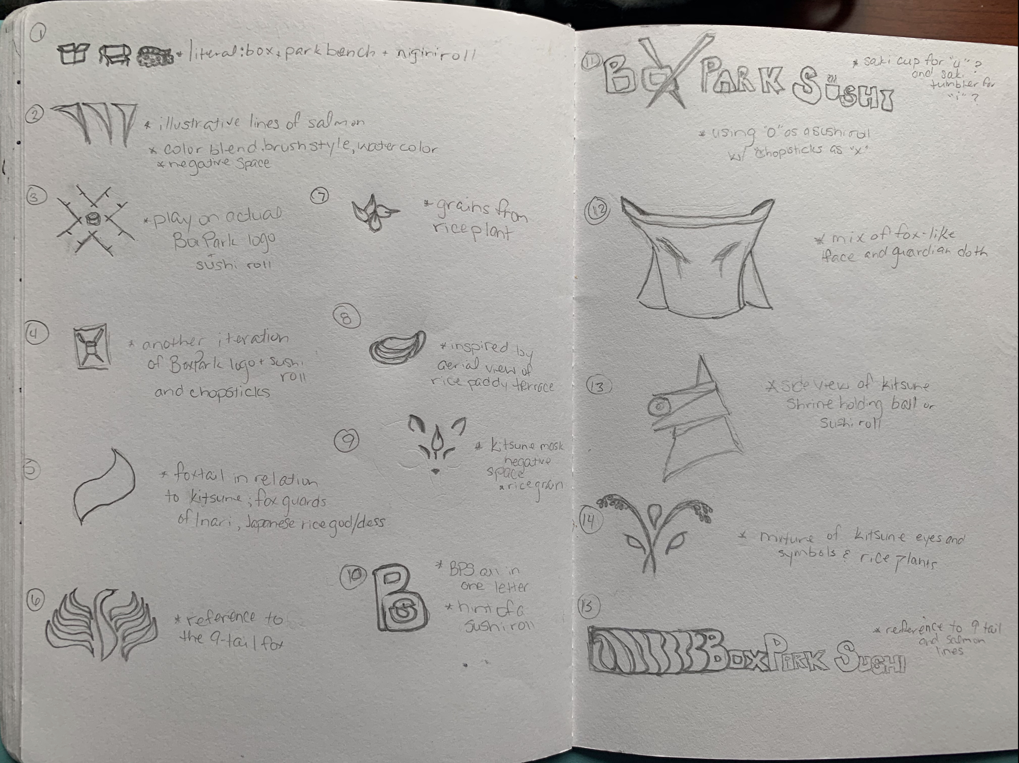
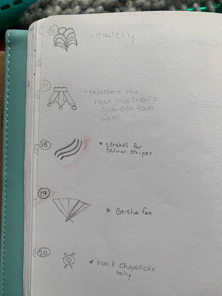
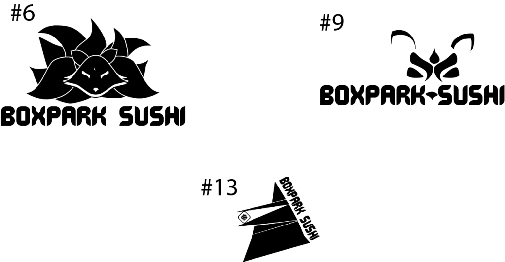
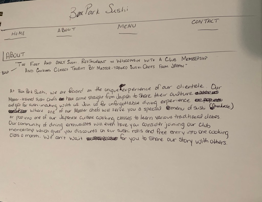
Defining Client Needs was my first real introduction to the design process. First, it was made clear to us that logo is not the same as a brand. Second, I felt like I received clear steps for developing an ideal logo concept which is how I learn. I needed to know what steps to take to go from an amorphous concept to having clear, physical representations of a company through the logo. When we initially created the mind maps for our city tourism project, I was skeptical of my ability to transform them into possible icons for the city. However, following Professor McClung’s guidance and plenty of research helped create images that were relevant and spoke to the character of the city I chose: Marrakech.

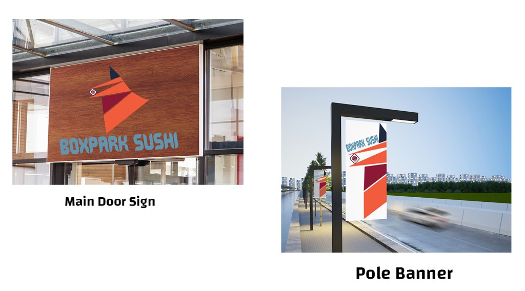
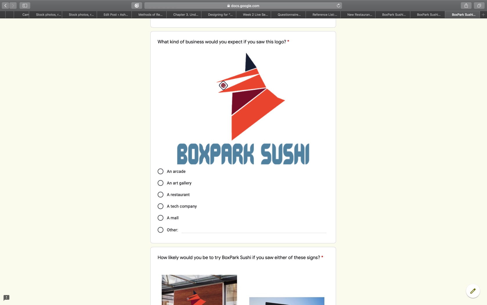
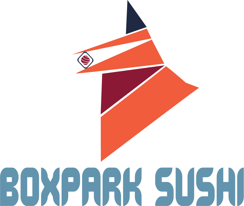
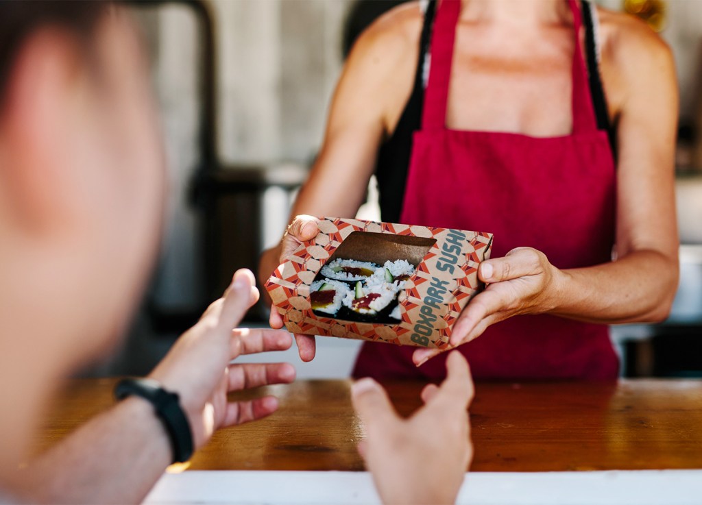
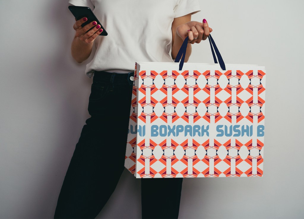
When it came time to later create the logo for the BoxPark Sushi restaurant concept, I was able to utilize these same practices. I started by creating a mind map then moved into researching more terms and ideas which ultimately led my focus on the kitsune, a Japanese Shinto fox spirit, that became the icon for the restaurant. This process made it easier for me to create a unique icon for my thesis project and also gave me the confidence to start taking on freelance logo work as well.

Month 3: Brand Development

Personal triumph of the month: Utilized Adobe Illustrator, InDesign, and Photoshop for the first time!; Created first vision boards

Final version of the Culture vision board

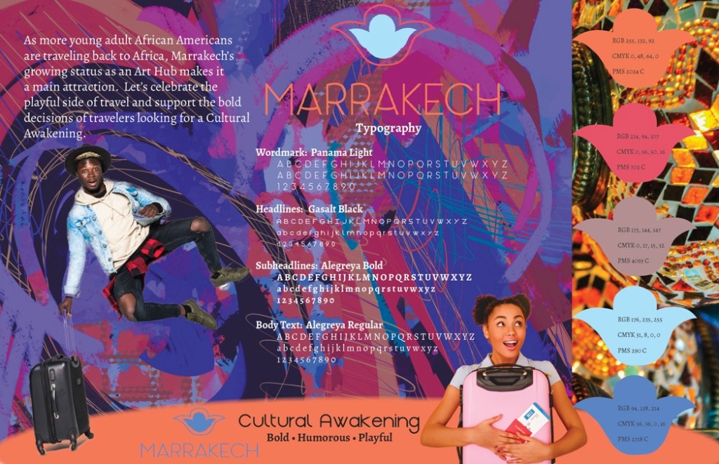
In this month, we continued building our city tourism projects by moving from logo iterations to developing brand personalities. This was another step in my understanding of how to create an identifiable brand. This course showed me one of the ways to develop a personality for a company or campaign. To finalize the personality, I really had to connect the research of brand personalities with what each version of the city tourism project was conveying. Coming up with three different options for each category was initially intimidating, but I think it also helped me see that there is no one way or end-all-be-all to a logo iteration or a brand personality.

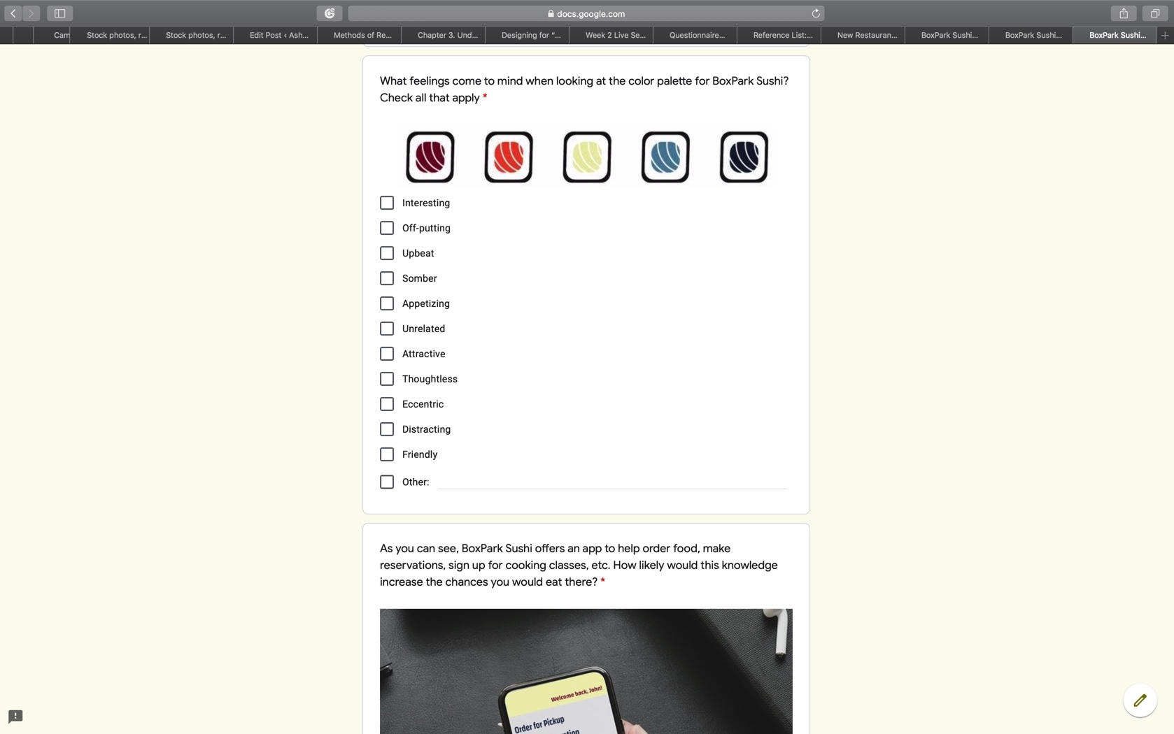
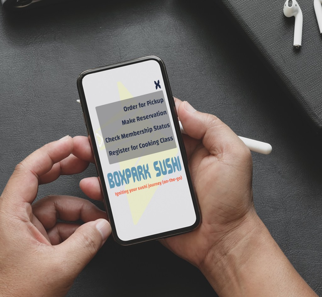
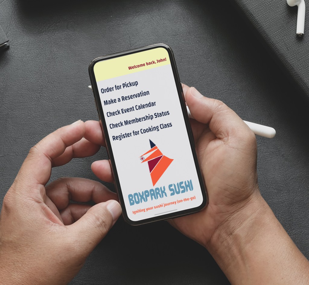
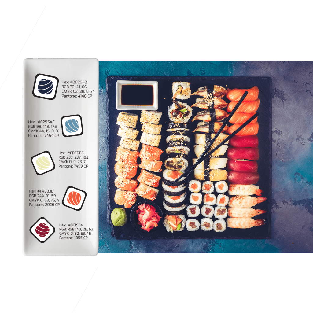
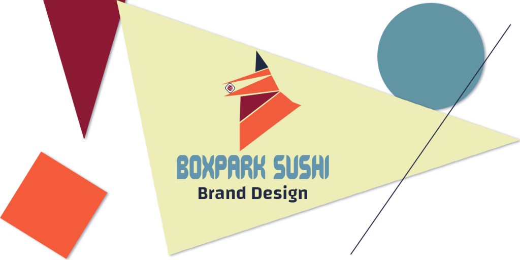
When it came time to complete the thesis project, these steps again came into practice when creating BoxPark Sushi’s personality as well as its static vision board. The overall personality of BoxPark Sushi became “social, daring, genuine, and inviting”. Using these adjectives to describe the restaurant helped create a unique color palette, develop a fun and inviting voice and tone, as well as helped show a different take on a traditional restaurant-style. Overall, the skills learned in this course helped shape the overall feel of BoxPark Sushi, making it a key addition to my portfolio.

Month 4: Effective Copywriting

Personal triumph of the month: I was able to break away from my academic writing voice and get a little more creative; Developed my first Ad campaign

Final versions of my ad testimonials

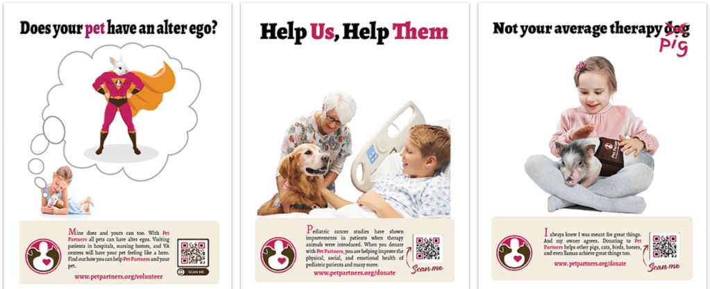
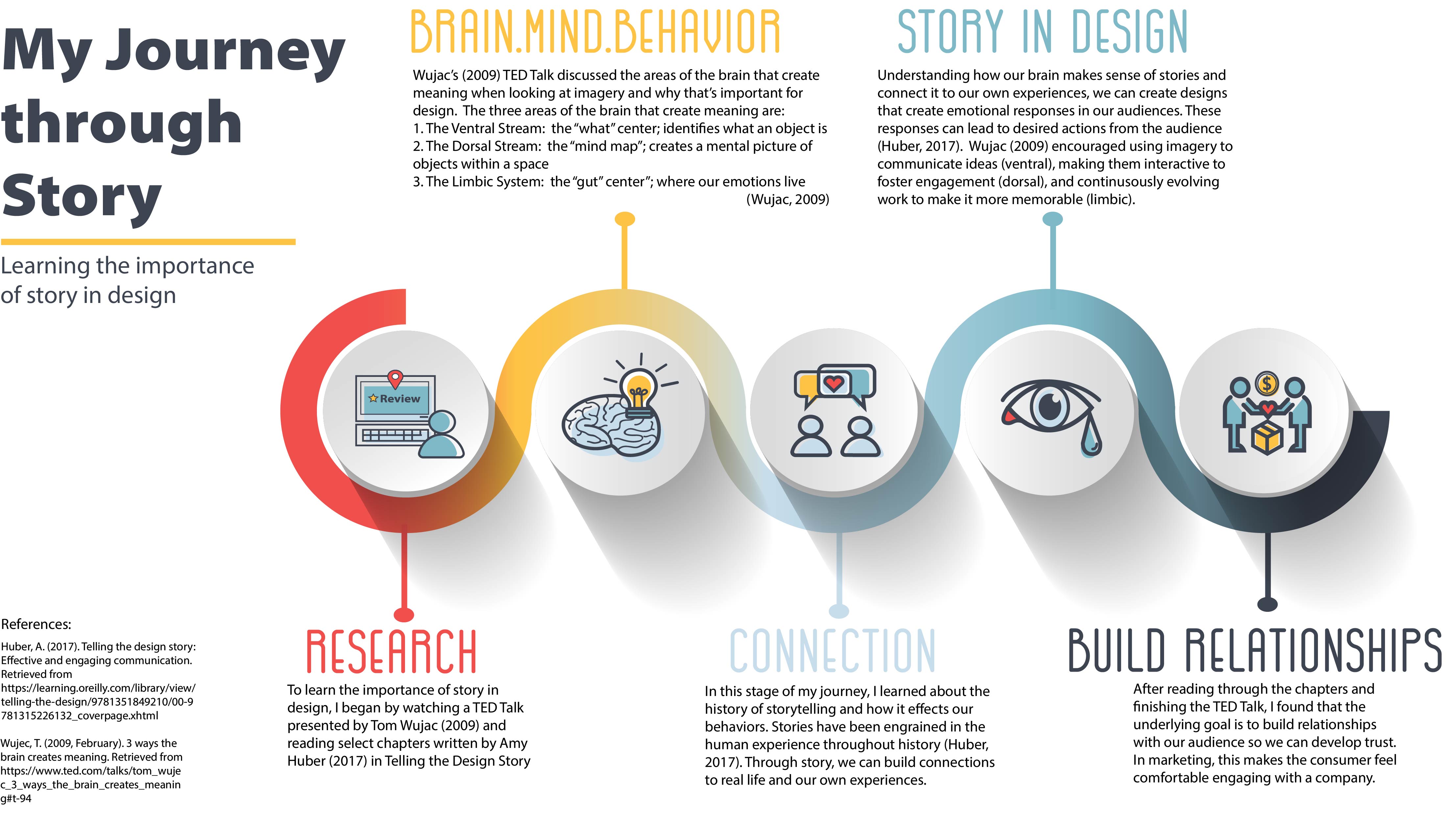
I thought this class was going to be a lot easier for me because a lot of my undergrad and 1st Masters consisted of writing. And admittedly, I think I write very well. However, that has all been academic writing. The creativity that goes into copywriting is a whole ‘nother story. I thought my academic writing skills would make it easier to develop taglines for our assignments, but it actually made it harder. I really struggled to develop creative, catchy, and representative descriptors of Pet Partners, the nonprofit organization I chose for the course. However, breaking down the different types of taglines using Schwartz’ (2006) definitions of rhetoric.

Again, for the BoxPark Sushi project, I utilized Schwartz’ definitions to develop the restaurant’s tagline. Originally, the tagline was tagline read: “Enticing, exciting and igniting your sushi journey” using meter described by Schwartz (2006). However, after receiving feedback and thinking about the characteristics of BoxPark Sushi, the final tagline became “Igniting your sushi journey”. This clearly laid out the intentions of the restaurant and introduced the sense of adventure the personality conveys. Being able to break out of that academic writing helped me explore new ways of describing a company in a phrase. Learning this also helped me develop a tagline for myself as a designer. While it is still a work in progress, I have come up with:

“Former mental health counselor turned investigative designer with a passion for bringing projects to life”.

Semester 2

Month 5: Design Research

Personal triumph of the month: That I made it through the month without quitting…What? Sometimes that alone is an accomplishment

Empathy map for Meridian St. North place branding

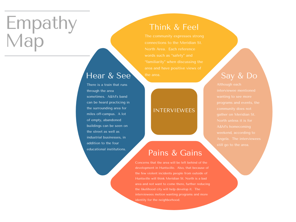
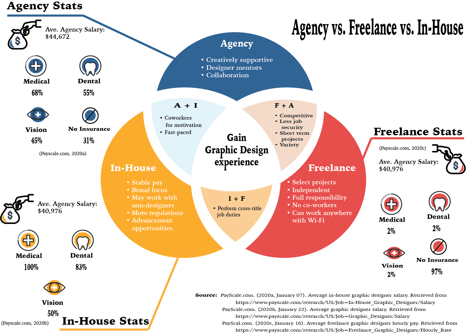
As you could gather from reading my post for Month 5 was rough. However, I learned valuable information about Place Branding as well as conducting primary and secondary research. This month was not the most exciting in terms of design, but it was a necessary installment to help clarify the importance of hearing directly from your target audience, when able. Being able to redefine a neighborhood or area of my city also helped the project feel more personal. In future, I actually hope to continue working on the place branding I started for the Meridian St. N. area in Huntsville, AL to make it a STEAM-focused learning district. I hope to give back to my community and this is only one way that I feel I can contribute.

Overall, learning the fundamentals of primary and secondary research helped catapult the entire BoxPark Sushi project. I learned so much about sushi that I didn’t realize I had wrong and was able to create an identity that would exemplify the restaurant. This course also helped me navigate researching the East Side Milwaukee area similar to what I did for my neighborhood. I was able to incorporate some of the same strategies such as checking the demographic and cost of living in the area to help shape BoxPark Sushi’s target audience.

Month 6: Organizational Structures

Personal triumph of the month: Created and edited first projects in After Effects and Premiere Pro; Created a 3D infographic

My kinetic typography based on a fictional Pet Partners’ therapy bunny

Organizational Structures was an interesting month as it not only forced me to learn Adobe After Effects and Premiere Pro, but I also got a feel for creating infographics, as well. Following the Adobe Help (n.d.) tutorials gave me foundational techniques to create basic projects in both video editing programs. Coming into the degree program, my only experience with video editing was putting together picture slideshows in Windows Movie Maker. While this came in handy, a little, I had so much to learn when it came to putting together a story that encapsulated the audience.

This ability translated over to the creation of the dynamic vision board for BoxPark Sushi. It helped me understand the foundation of video editing and gave me the confidence to try new things when creating the promo. While I was still new and had more to learn, I have been able to translate the skills I developed in this course into real world experience. I am currently developing promo videos for a local music studio using the skills I learned in this course as well as new ones I’m learning every day. I have really come to love motion graphics and feel this is one area I plan to extensively continue developing my skills.

Month 7: Design Strategies and Motivation

Personal triumph of the month: I was able to create my first brand concept from beginning to end.

A portion of the creative brief

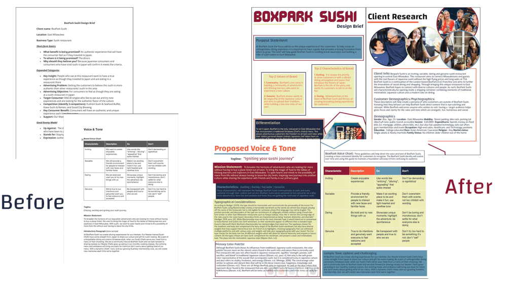
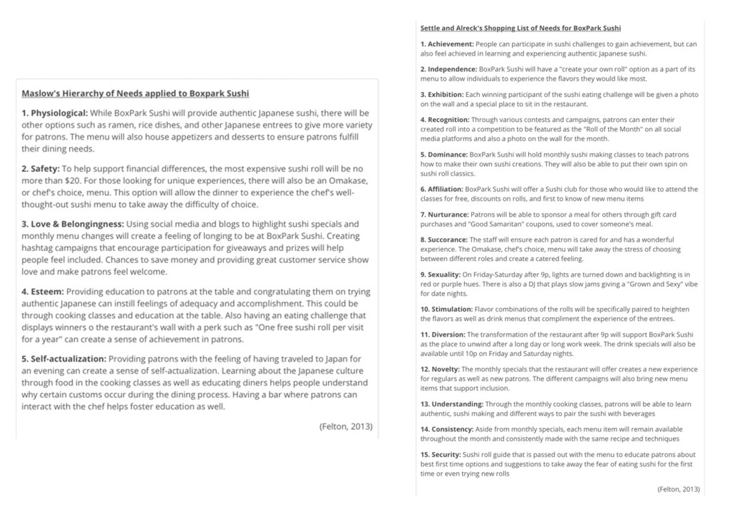
Coming up with a design strategy for BoxPark Sushi seemed overwhelming in the beginning. I had no idea how I was going to make sense of a restaurant when the only prompts I had were: It’s a sushi restaurant named BoxPark Sushi, in a shipping container, and located in East Side Milwaukee… Right. So, naturally I knew exactly what to do *does my sarcasm translate well through text?*. Learning to put together the design brief definitely helped create a phsyical structure to devleoping a concept. Incorporating Maslow’s Hierarchy of Needs and Settle and Alreck’s Shopping List of Needs, helped build insight into what my version of BoxPark Sushi wanted to accomplish. As this was a part of my thesis, I can only say that this course helped really build the foundation for the overall concept. While some parts were taken away or replaced, the overall personality, voice, and tone were developed using this design brief.

Month 8: Design Integration

Personal triumph of the month: Created a dynamic vision board that communicated BoxPark Sushi as a restaurant that will take you on a journey

Final version of dynamic vision board

As its name suggests, the Design Integration month really started to meld all of the skills we learned into each assignment. In this month, I used skills from Brand Development to create the color palette and identify the voice and tone for BoxPark Sushi. I also used what I learned in Organizational Structures to create the dyanmic vision board. This month was clouded by shutdowns due to COVID-19 and going into quarantine so it was stressful, but I was able to create the first look at BoxPark Sushi as a concept. Again, everything learned in this course was put toward my thesis project to create the first visual picture of BoxPark Sushi.

Semester 3

Month 9: Multi-Platform Delivery

Personal triumph of the month: Created a cohesive brand guide!

Cover of brand guide

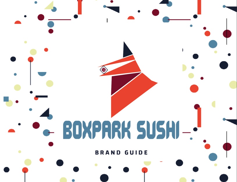
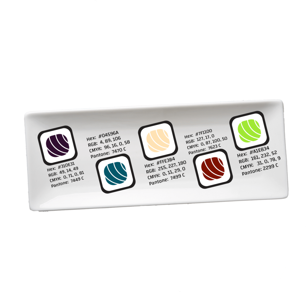
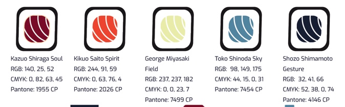
During this month, I had been in quarantine for weeks and was staring to feel like I was getting nowhere with my school work. I wanted to quit or take a break, but felt like if I did, I would never start again. So instead I tried to throw myself into other activities to keep me sane. I still did schoolwork too. The brand guide–which can be viewed here–was difficult to finalize. My original concept was too static and didn’t really have a theme. With advice from Prof. Argo, I finalized the guide using an abstract expressionist theme. My favorite part of this project was naming color in the palette after Japanese abstract expressionist painters whose styles enhanced the color.

From left to right the painters are: Kazuo Shiraga, Kikuo Saito, George Miyasaki, Toko Shinoda, and Shozo Shimamoto

Month 10: Measuring Design Effectiveness

Personal triumph of the month: Receiving positive feedback for my overall design of BoxPark Sushi

Infographic displaying the results of BoxPark Sushi questionnaire

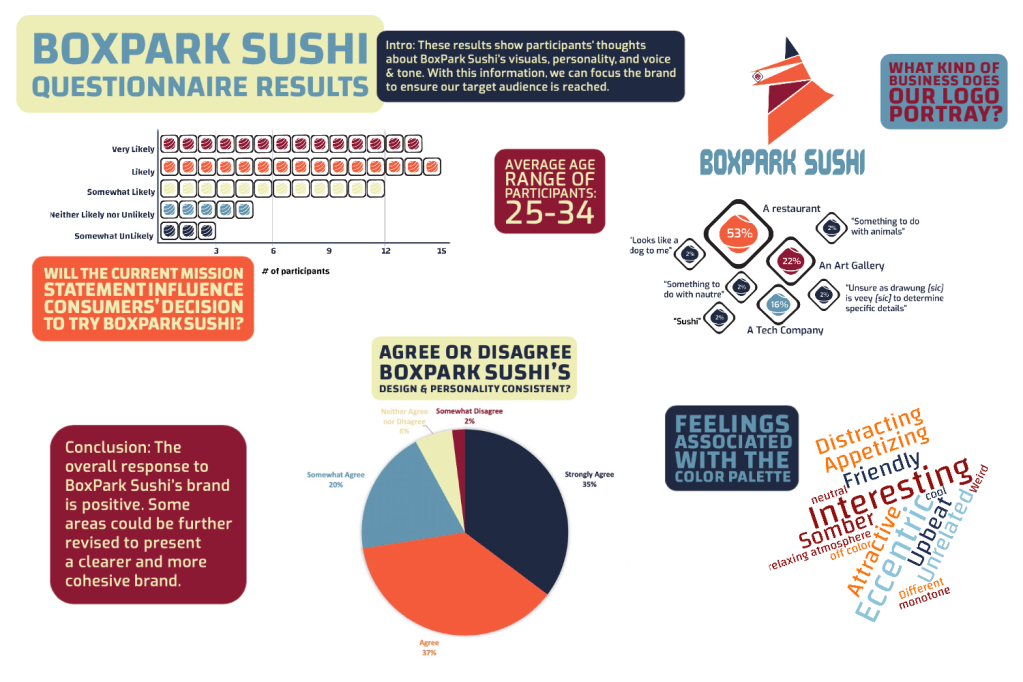
Coming into Design Effectiveness, I was unsure how well my concept for BoxPark Sushi would be received. I started having doubts about a restaurant being this eccentric but still trying to incorporate traditional methods. However, taking the time to craft questions specific to what I needed to know and getting feedback from individuals helped me understand the importance of checking in with the audience. It made me wish we checked in with people outside of our cohorts sooner. While the brand’s design was received well, there were some areas I may have been able to tweak sooner to communicatte BoxPark Sushi more clearly.

Month 11: Presentation of Design Solution

Personal triumph of the month: Creating a functional design layout for my thesis; Creating my first Behance project

Title slide for Behance project

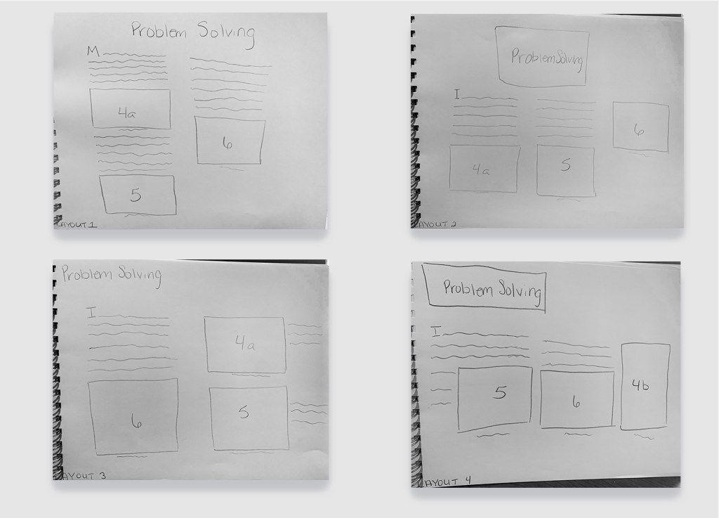
The Presentation of Design Solution course was the culmination of everything I learned throughout the program. I was able to identify all four DLOs and create pages of projects to back it up. The work put into the website was extensive. I struggled with proper layout and placement of text to create fluid movement through the page. After several consultations with instructors, classmates, and my mentor, I was able to create a layout that helped appropriately showcase the work and the justifications. Also, creating my first Behance project was another challenge. I have been on Behance since the beginning of the program and have often used the work on there to inspire my own designs. While I toyed with the idea of uploading my projects throughout the program, the final portfolio assignment, forced me to make this a reality. I was so grateful because I kept putting it off. When it came down to it, I just had to turn it in. This brought back my weakness from Month 1 when I identified my difficulty with overthinking. I’m proud of myself for completing the task, but I realize I still need to push myself to do new things even when they’re not required of me.

Month 12: Professional Practice

Personal triumph of the month: With this post, I just finished my 2nd Masters

Also, personal triumph of the month: Created my first 3D project with isometric view in Illustrator

Sketch of experience map
Final version of experience map

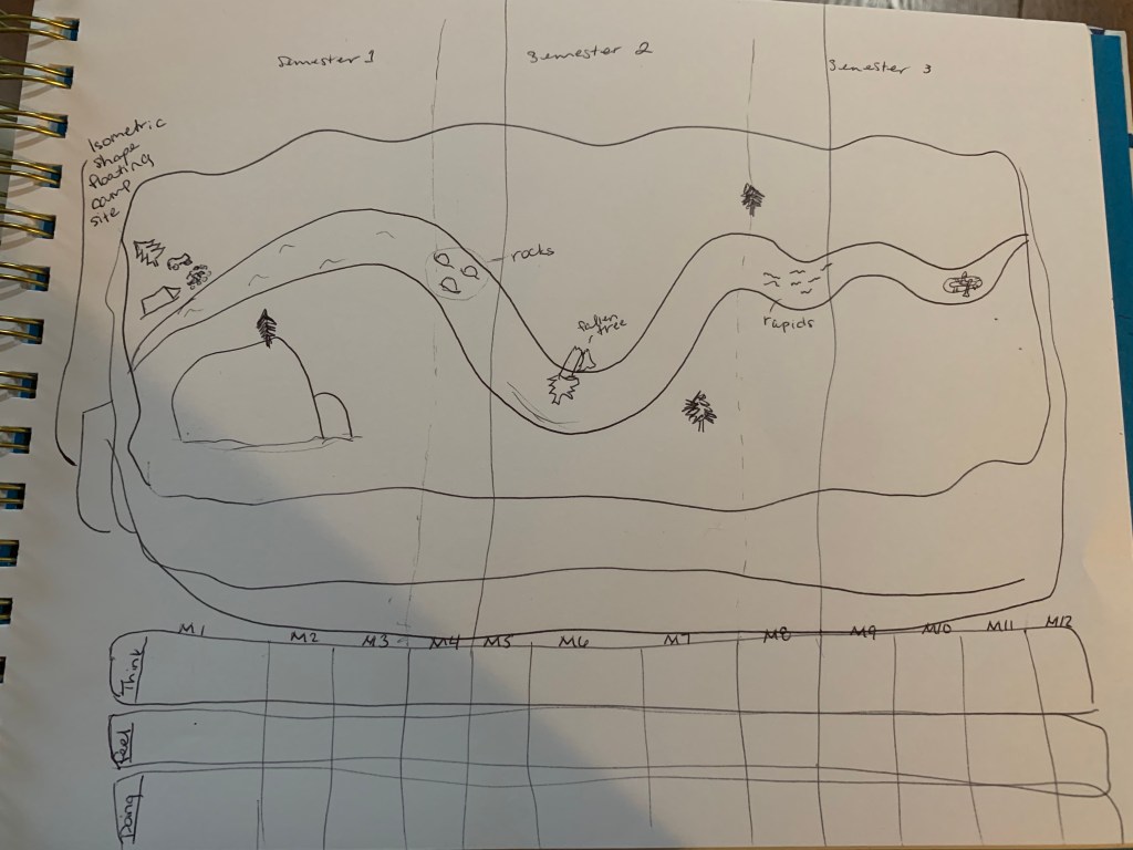
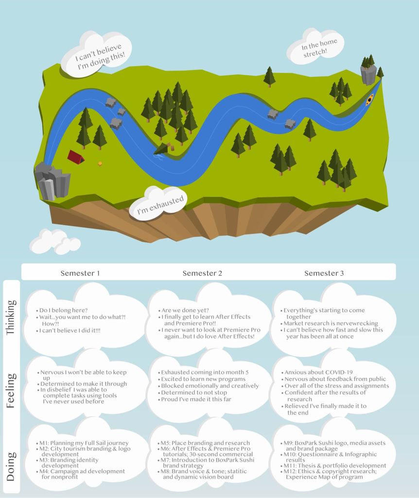
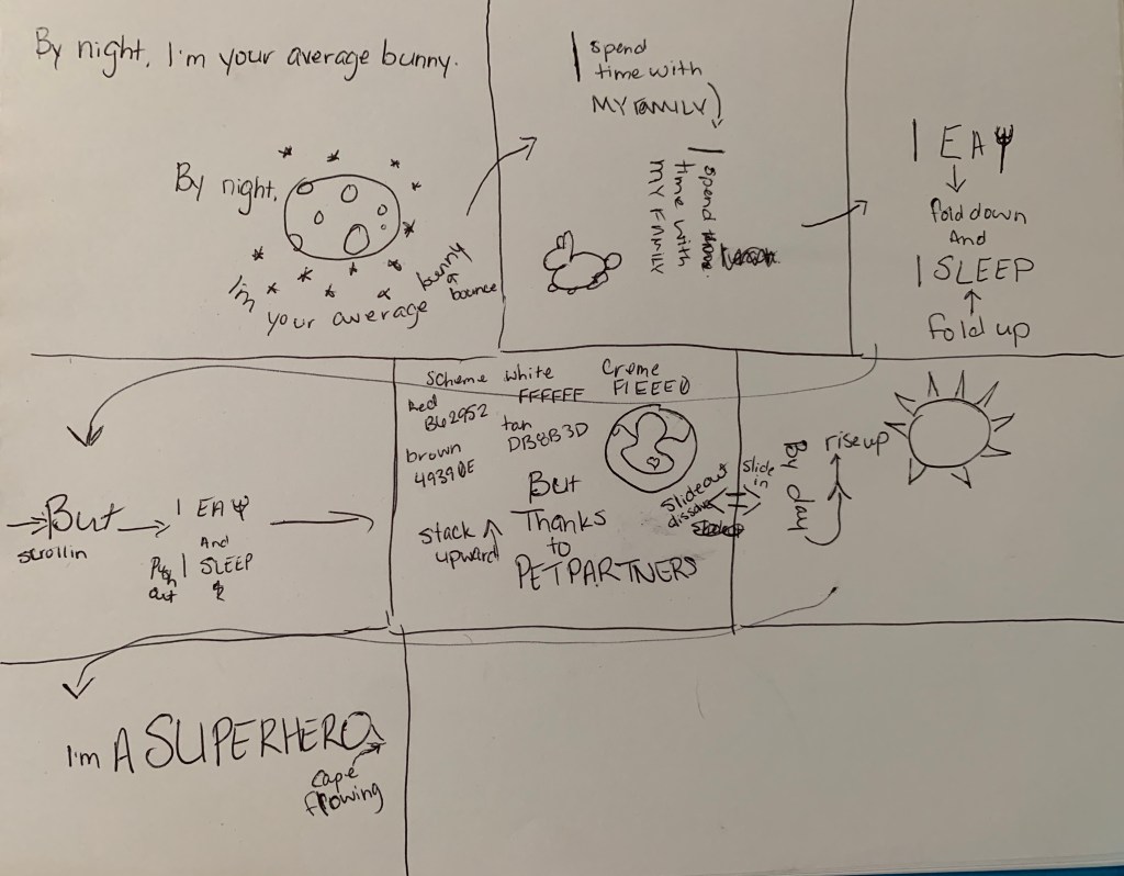
To put my revelation from Month 11 into practice, I used the experience map in this month to push myself beyond my comfort zone. I was able to create a 3D floating island with a winding river to showcase the ups and downs I experienced in the program. While I had to overcome setbacks such as watching tutorials where the designer was using Illustrator in another language, I was able to create this beautiful story. I chose to present the experience map in isometric view, not only because it would be a challenge for me, but because I felt that it created a broader picture of everything that encompasses a scene. While the kayak is already down river, there is still a fallen tree obstructing the path affecting the water flow. Overall, the map was a testament to how far I’ve come with this program. I couldn’t have ended on a better note. Thank you for taking this journey with me, whoever you are.

References:

Greene, R. (2012). Mastery (5th ed.) [eBook version]. Retrieved from vbk://9781101601020

Swartz, E. (2006, June). Wag the tagline. NHFAโ€™S Home Furnishings Retailer, pp. 36-39. Retrieved from https://fso-lms4-immortal-assets.s3.amazonaws.com/104/20173/777b3424-3f9f-4534-85ed-f03b304c9bdc-058c850c-a4db-44c6-81b4-ef85600eb8a8/Wag_the_Tagline.pdf?X-Amz-Algorithm=AWS4-HMAC-SHA256&X-Amz-Date=20191115T020651Z&X-Amz-SignedHeaders=host&X-Amz-Expires=600&X-Amz-Credential=AKIAI4QJ7YJDQ7JYMBXQ%2F20191115%2Fus-east-1%2Fs3%2Faws4_request&X-Amz-Signature=9c49cc1830c3f89616b9adf54c5dc4573d10759f391549d10b960a7147bf3736

Month 11: Presentation of Design Solutions

When I say this month tried my patience, IT. TRIED. IT. Leading up to the thesis, was the most anxiety-provoking experiences I’ve had…since I wrote my last thesis in 2017…*don’t judge* school and I have a love-hate relationship. It really is hard to believe a year has passed and I am only a few short weeks away from accomplishing another goal I’ve set for myself.

This month has added new experiences to my skill set and helped me push passed some of my long-term fears. In this course, we worked toward drafting our thesis presentation based on the four desired learning outcomes (DLOs): Connecting, Synthesizing, and Transforming; Solving Problems; Innovative Thinking; and Acquired Competencies. I also built my own Wix site detailing how my projects show mastery of the DLOs and created a Behance profile to showcase my process developing the BoxPark Sushi design strategy. With all of this done, there are a few things I have taken away from this month.

1st. You can never know everything, but with Google you sure can find out a lot

The first two weeks were spent building up our DLO abstracts that would serve as the foundation of our persuasive argument for mastery. Writing four mini papers justifying and supporting a year’s worth of design decisions with references requires a lot of information that I did not have. Thankfully, Google (and a long browser history) helped me find old sources that I had forgotten to write down or find better ones when the original could not be located. Writing the abstracts reminded me that it is important to keep up with the details that support our decisions so that we can confidently relay the information to clients and show our idea has merit. While my peer review reminded me to break up run-on sentences. Using Google helped find support sources for design decisions made almost a year ago.

My abstracts after being peer reviewed by a classmate.

My husband often jokes that there’s no reason people shouldn’t know things because it takes as much time to Google it as it does to say “I don’t know”. When it came time to design layout options for our Wix site, I was stumped. Although I’ve completed freeCodeCamp’s Responsive Web Design cert and am working on the Front-End Web Development track through Treehouse, I didn’t really know how to properly design a website layout. So I Googled it! My eyes were opened to the world of website layouts and white space.

Needless to say, I used the wonderful sources from my best friend, Google, to create multiple drafts of layouts for my Wix site. I wanted to keep the information to be as neat as possible so I decided that going with a column grid would create a cleaner look and minimize paragraphs running across the screen. However, I needed to come up with four layout designs PER DLO so I had my “Google” cut out for me (stick around, it gets punnier).

Examples of the Problem Solving DLO draft layouts

As a student entering into the job market, I will not know everything there is to know. I will be tempted to portray that perfect employee persona to avoid admitting that I actually have imposter syndrome… That’s it. There’s no major resolution. I’m just glad I’ll have my new husband, Google, to get me through it.

2nd. Having a centralized location for my work is paramount as a future graduate

Starting out with this month, I was worried about having to create a Wix site and a Behance portfolio. I’ve been on Behance for almost a year and the work is amazing, so I was definitely intimidated to think I had to put a project up, as well. Of course, having pu the project up, I feel like a major hurdle has been cleared and I’m proud of myself for completing the task.

The Wix site was meant to work as a presentation for our thesis to live. We gathered all the information we used to support our design decisions (remember Google? this is where that comes in handy) and displayed them on our site. While I went through several drafts of my site layout, I ultimately ended up with a layout that is clean and showcases the material well. To look at the rest of my layout choices, click here!

Screenshot of Wix Solving Problems DLO

Completing the Behance project also helped create a location for future projects to be housed. While I could have done this on my own time, having a time crunch definitely helped give me the push to actually put something on the site and made it a lot less intimidating. Being able to showcase things I’ve worked on is going to be important for my future, especially if I end up working as a contractor. Moving forward, I will need to continue uploading projects and working through my experiences so that I can overcome feeling like an imposter. To check out my Behance project, click here!

3rd. The Rule of Thirds is life (see what I did there?!)

Last, but definitely not least, the Rule of Thirds is a lifesaver. I struggled a lot with placement and spacing during this process. Introducing the Rule of Thirds helped me focus on how I place objects in relation to one another. Aligning objects to the four points of the intersecting line can create a more balanced and pleasing layout (Hampton-Smith, 2018; Reid, 2017). Now that I have a better understanding of how to utilize the Rule of Thirds, I can incorporate it in future designs to improve my layouts, reduce crowding, and explore unique spacing that heighten my work.

Behance design using Rule of Thirds guide

Moving Forward

So that’s what I took away from this course and finalizing my thesis presentation and portfolio. I am honestly proud of myself for making it to this stage in the program despite set backs and other difficulties. Overall, what I’ve taken away from this experience is that I have the skills and knowledge to work in many different avenues. I just need to continue networking and creating projects whether for profit or as a way to build my portfolio.

But I’m not done yet. I still have another class before i’m done!

References:

Hampton-Smith, S. (2018, September 26).ย How to create balanced page layouts. Creative Bloq. https://www.creativebloq.com/netmag/create-balanced-page-layouts-7-pro-tips-121310009

Reid, M. (2017).ย The 5 rules of design composition and layout. 99designs. https://99designs.com/blog/tips/design-composition-and-layout/

Month 10: Measuring Design Effectiveness

I feel like I have tunnel vision. We’re so close to being done and I can’t believe it. There’s so many things going on around me and I just have to stay focused on this so I can get it done and out of the way. However, I have been excited about the future, despite the chaos that is swarming around us in the U.S. I am looking forward to new opportunities and I hope all of my classmates are finding the silver-lining in almost being done with the program and having accomplished their goal.

We are going to make it, y’all! #ClassOf2020

Overview of the material and concepts learned this month

Connecting/Synthesizing/Transforming

This month, we focused on using surveys and questionnaires to evaluate our designs and gauge our target audiences response to BoxPark Sushi. As O’Grady and O’Grady (2013) identified “understanding how your practice creates value is essential to growing your business and building better, more profitable relationships” (Ch. 3, para. 5). The best way to showcase these benefits is through clarifying your hard and soft values. The hard values describe the tangible and measurable things your services can do for the client such as saving them time or money on a project using your methods or saving money on materials, etc., while soft values are the emotional connections that the audience may have to the design (O’Grady & O’Grady, 2013).

Carlsson (2019) agreed that by presenting the hard and soft values of design, we are helping businesses to combine science and art to know the unknown. This approach is more humanity-based and allows us to have a more realistic view of a project’s outcome. With this in mind, I created and distributed a questionnaire to my friends on Facebook, Instagram* and Twitter*. As O’Grady and O’Grady (2009) point out, a questionnaire, which is taken online or by paper, helps collect qualitative as well as quantitative results regarding designs.

*My profile on this platform is open to the public

Problem Solving

One of the most important and most difficult parts of designing the questionnaire was structuring the questions in a way that would give me the most useful responses. Even with a Bachelors in Psychology and some experience with conducting reserach, it is a whole ‘nother situation trying to evaluate visual designs. As much as I wanted people to say the designs made sense or worked, I wanted to make sure the questions allowed people to say when or how something doesn’t makes sense. O’Grady and O’Grady (2009) stated, that “questions should be written and structured in ways to increase the reliability of valid findings” (para. 2). My goal for the survey was to know if people felt the designs were consistent enough to further brand awareness, especially when it came to the pole banner asset, t-shirt, and mobile app as each of these assets has a design that differs from the logo.

Sign comparison images included in the questionnaire

To identify if participants felt these signs were for the same brand, I structured the question (referring to the above image) to ask “Do the designs from the previous question appear to represent the same business?”. The results showed that out of 51 participants, 78.4% of them agreed “Yes” the signs appeared to represent the same business (Coleman, 2020). One participant stated, “Iโ€™d probably have a hard time finding thedoor sign since itโ€™s a different color” (Coleman, A, 2020, particpant #23). This information helps understand why they feel the design does not work for them. Having enough insights such as these helps to make decisions about how the brand can best meet its users’ needs (O’Grady & O’Grady, 2009). Structuring my questionnaire to include images with the question, providing access to the brand guide at the top of the questionnaire, and including the link to the brand guide in Question 9 helped ensure participants actually looked at BoxPark Sushi’s visuals and could get a feel for the personality to answer the questions as accurately as possible. While it does not guarantee they took the time to read the whole guide and internalize it, they were still able to get a feel of BoxPark Sushi’s brand with the inclusion of images in the questions and the way the questions were structured.

Innovative Thinking

One of the hard values this questionnaire would have provided for my client is saving money on the cost of testing using Google Forms rather than Survey Monkey. During the survey design, one of the issues I ran into was having to get passed Survey Monkey’s costs for adding images to each question. Although I could have linked my brand guide to the questionnaire, I wanted to ensure that participants actually saw the images and didn’t just try to go through the survey answering questions without looking at anything.

Top Image: Example of Survey Monkey questionnaire; Middle and Bottom Image: Example of my BoxPark Sushi Questionnaire

For a college student completing a project, Google Forms provides the most affordable option for testing because it’s free! It not only allowed me to put pictures with each quesiton, but I customized the survey to reflect the brand’s color palette and even chose the type that was used. As the Pew Research Center (n.d.) notes, researchers sometimes put out open-ended question surveys to find common answers and use the responses to create close-ended questions to put out the survey again.

If that was something I had time for, Google Forms would be the best way to run that preliminary questionnaire and then, if I had allocated funds, I could use Survey Monkey to utilize the industry-standard testing site. Admittedly, the one thing, I would have liked to include was an additional text box with each question in my Google Forms questionnaire to allow participants to add their personal thoughts (which Survey Monkey allows) but I had to make do with what I had. Another plus in Google Forms’ favor is that there is no limit (as far as I know) to how many participants took my questionnaire. Survey Monkey stops providing responses for survey participants after 42 or 43 people have completed it unless you upgrade to one of their paid subscriptions. Again, when I have funds provided to me by clients this will no longer be an issue, until then I’ll stick with Google Forms.

Acquiring Competencies

Academic

  1. Hierarchy of User Needs (Conceptual): Understanding this concept will create more focused and pleasing designs as its sole purpose to appeal to what users find valuable about the project.
  2. Hard Values (Conceptual): Being able to identify how your project can show tangible and concrete benefits is imperative, especially in a freelance position or agency, to stand out to clients. This is sometimes harder to do than I thought it would be, but I having created projects with others that saved them money is probably my closest example.
  3. Soft Values (Conceptual): However, it is just as important to provide a service that elicits an emotional connection that is subjective and intangible. A big part of my designs rest on creating emotional connection, whether good or bad.
  4. Surveys & Quesitonnaires (Technical): Using these techniques has helped me understand how to reach the targeted audience in an easy and accessible way. It was not as nerve-wrecking or soul crushing as I thought it would be to have someone evaluate my designs.
  5. Models of Design Education (Conceptual): In today’s world, designers are not limited to one box. We are being trained to be Jacks-of-all-trades and I love knowing how to do little bits of many things. I do recognize that it would be helpful to have at least one or two skillsets that I am well versed in so I have a grounding skill to branch out from.
  6. Design Thinking (Conceptual/Technical): This is both technical and conceptual because of the results that come from design thinking. When starting a project, I may start by sketching then do research or vise versa. There are so many moving parts to design thinking and how it drives our process that it takes on many forms.

Occupational

  1. Adobe Spark (Technical): For social media purposes, this platform allows for an easy transition between Adobe Stock and the project. It’s ease of use makes it valuable for creating projects such as infographics
  2. Research (Technical): Conducting research, whether its qualitative or quantitative, requires a curiosity and drive to finding and sharing the answers, even when the results are not what you thought they would be or might want them to be. With my background being in Psychology, I love conducting research that explores both the quantitative and qualitative (mixed method) of a study. I think having both helps create the fullest picture and can start to explain the ‘why’ of things.
  3. Case Study (Technical): Completing a case study has helped to look closer at the project and find its hard and soft values. This is how designers can learn from any possible missteps and realign their approach from project-to-project or even while they’re still working on a project.
  4. Evaluating design (Technical): Taking the time to have the end user evaluate a design, preferrably before the project is finished, can not only save time and money but can strengthen brand loyalty. It is so helpful to have an idea or direction to go in and keeps designers on track to creating a project with the most value.
  5. Design Staircase (Conceptual): This concept also focuses on providing value but focuses more on how a company integrates design into its business model. Finding a company that has fully integrated design into its practices would be ideal as it shows their belief and trust in design as an equally important part of their company’s functioning.
  6. Data Visualization (Conceptual/Technical): Being able to condence complex ideas into visual designs is an important skill these days and understanding the best way to do this is a huge requirement. Having experienced how difficult this can, I feel that strengthening this skill will go a long way towards making me a more diverse designer.

References:

Carlsson, F. (2019, Dec. 2). Designing for “what we don’t know”. Medium. https://medium.com/a-view-from-above/designing-for-what-we-dont-know-6b0e3ea50aef

Coleman, A. (2020). BoxPark Sushi Brand Awareness Questionnaire [Data set]. Google Forms. https://docs.google.com/forms/d/1dBA9VAS0ZSzC5ik6grj2kL0vnaOcoL17oTbXZ4V0jGs/edit#responses

Oโ€™Grady, K. & Oโ€™Grady, J. V. (2009). Methods of Research (8/10). In K. Oโ€™Grady & J. V. Oโ€™Grady (Eds.),ย A designerโ€™s research manual. (pp. 48-49). Rockport Publishers. https://learning.oreilly.com/library/view/a-designers-research/9781592535576/chapter-16.html

Oโ€™Grady, J. V. & Oโ€™Grady, K. V. (2013).ย Design Currency: Understand, define, and promote the value of your design work. New Riders. https://learning.oreilly.com/library/view/design-currency-understand/9780133052862/ch01.html

Pew Research Center. (n.d.).ย Questionnaire design. https://www.pewresearch.org/methods/u-s-survey-research/questionnaire-design/

Month 9: Multi-Platform Delivery

Despite running out of shows to watch, learning to design a portfolio in Webflow (it’s a work in progress), finishing the concept art for an artist’s EP–check it out here, trying to pick back up learning French, running out of laundry to wash and things to clean, I have found that my ability to concentrate on important things like homework is quite difficult. However, I was able to finish Month 9 with my brand guide and my sanity (somewhat) in tact. And just in time for me to start a new job tomorrow!

So to kick off my last night of not having to wonder how many different ways I may have just contracted Miss Rona, I’m going to tell you about how month 9 of the program went!

Overview of the material and concepts learned this month

Connecting/Synthesizing/Transforming

A large part of this month focused on logo and media asset creation. As it we move closer to finishing our BoxPark Sushi concepts, we are finalizing the brand’s personality and were tasked with creating physical representations of its identity. For this version of BoxPark Sushi, the focus has generally been on the preparation of sushi in the traditional manner performed by Japan-trained chefs and creating a social restaurant built around engaging activities and memberships. The question was how to find a logo that would represent these two visions.

Using Airey’s (2013) directives to make a simple, relevant, enduring etc. logo, I created a mind map of pretty much anything I knew about Japan and sushi off the top of my head. When I hit a road block, I began my research using what I had and allowed it to inform new directions to broaden my knowledge-base. My overall goal was to create something relevant that spoke to the traditions of Japan without appropriating or being tone deaf to the culture. Pncadmin (2017) acknowledged that when creating a logo, culture can have a significant impact on the acceptance of the company and can even go as far as destroying the brand before it even launches. Colors, symbolism and design represent different things in various cultures and while we may not be able to foresee them all, taking the time to be aware may minimize negative consequences (Leow, 2017; pncadmin, 2017). Although I’ve grown up watching anime and have dreamed of going to Japan, I knew I was no expert of the nuances of Japanese culture.

According to Commisceo Global (n.d.), traditions are very important to Japanese culture and one of those traditions is the Shinto religion that is indiginous to Japan. This religion, still practiced today by at least 60 million pople, highlights the kami, or divine spirits, who roamed the Earth (Commisceo Global, 2015). There are gods and goddesses who represent aspects of nature. To this day, there are several nationa festivals, rituals, and practices in Japan that specifically honor Shinto deities (Commisceo Global, 2015). My search led to Inari/Oinari, god/dess of rice, prosperity and love, who was represented as both male and female throughout history and has conflicting views of the deity’s character (Yoose, n.d.). Following this path, satisfied Airey’s (2013) suggestion that a logo also be based in tradition.

Through more research, I found that Inari/Oinari is one of the most recognized Shinto dieties, with one in every three shrines in Japan dedicated to the deity, and is often represented as either an “old man sitting on a pile of rice with two foxes beside him, or of a beautiful fox-woman” (Yoose, n.d., para.2). It was interesting that regardless of the representation, Inari/Oinari was often associated with kitsune, or fox spirits, who act as guardians and messengers of the deity. There are only theories as to why the fox is associated with the deity but living foxes are known to roam the rice fields in the growing season and eat rodents that would normally eat the rice (Yoose, n.d.). Kitsune are also widely seen throughout Japan as guardians to Inari shrines (Jamieson, 2018; Yoose, n.d.).

Using this idea of the Kitsune, or fox spirit, acting as a guardian of the rice at BoxPark Sushi and Inari/Oinari’s blessings of rice and prosperity, I began creating iterations of the logo.

Through logo refinements and critiques about the relevance, design, and possibilities of the presented sketches, I was able to narrow down the possible logos to three iterations.

Using Airey’s (2013) guidelines to creating logos, these three presented the most possibility to be scalable, distinct, were based in tradition, memorable, and could stand the test of time. The practicality of each prospect was taken into consideration, but #13, the geometric representation of a kitsune statue with its traditional red bib was the most distinct of the three. After further refinement and applying the color palette, this version of BoxPark Sushi’s logo was presented. Interestingly, not only were red and orange, already a part of my color palette, it was noted in Loew (2017) that orange is one of the only colors that does not have a negative connotation across cultures and red in Japanese culture denotes strenth, passion, and self-sacrifice (Oleson, n.d.). Although Inari/Oinari foxes are often depicted as all white, using the orange in the color palette not only allowed for a universally acceptable color, but also played more to the traditional representation of foxes.

Problem Solving

The design problem arose when considering how to make it easier for people wanting direct access to BoxPark Sushi’s menu, calendar, and operating status. The Boxpark Sushi app user-friendly as well as on-brand with the other assets. Originally, the design incorporated a simple user interface that made it easy to navigate for younger and older customers intending to order food for pickup, make reservations, check their membership status or sign up for a class. However, the colors were and layout were inconsistent with the rest of the assets.

Original app mockup

In addition to the inconsistency of the icon’s appearance, the use of the menu was deemed unnecessary as the app would only be able to perform those activities. Professor Argo (2020) challenged us to stop hiding behind menu boxes and allow the app options to exist in their own right. With that in mind and the decision to personalize the app by adding the customer’s name in the top right corner, the updated version of the app looked more welcoming and still easy to navigate for the tech-challenged.

Updated version of BoxPark Sushi app main screen

Innovative Thinking

Overall, the design of the carryout bag was innovative in comparison to what is commonly used in restaurants. Typically, a restaurant carryout bag is either similar to a grocery bag or a blank paper bag such as the ones Rice N Roll Bistro (n.d.), a sushi restaurant in East Side Milwaukee, uses. This is a typical industry standard.

Anthem Branding (2017) advises creating media assets than can be incorporated in customers’ daily lives. Having a convenient way to transport food home is nice, but then being able to reuse that bag to carry lunch the next day or two is more useful and it doesn’t hurt of the design is visually appealing. In addition to helping the customer find a environmentally safe way to carry food, it can also help spread awareness of BoxPark Sushi. According to Piletics (2017), reusable carryout bags and boxes are considered Australia’s third favorite media asset. The bag and box for BoxPark Sushi use a repeated pattern of the Kitsune icon to created dynamic shapes and visuals. This will make the carryouts stand out if taken to work or events. The name BoxPark Sushi is also printed repeatedly in a cutout section of the bag on all sides making it easier for someone to see where the customer got the bag without having to ask (in case they’re shy). The box also displays the restaurants name on the side, making it easily identifiable as well. Both items are recyclable and the bag is reinforced at the bottom to make sure food stays upright and deter leaks, making it reusable. This concept could be strengthened if BoxPark Sushi club members were given an insulated carryout bag upon joining or a tote with a reinforced bottom. These simple items are a first step to reaching new customers and building new relationships.

Acquiring Competencies

Academic

  1. Rationale (concept)
  2. Design Problem (concept)
  3. Clear Space (technical)
  4. Logo Configurations (technical)
  5. Brand Consistency (concept)

Occupational

  1. Retrospective (concept/technical)
  2. Brand Guide (technical)
  3. Adobe Dimension (technical)
  4. Product Mockup (technical)
  5. Design Layout (technical)

In case you missed the link above, here’s a look at my brand guide!

BoxPark Sushi Brand Guide on Issuu

References:

Airey, D. (2014). Chapter 3: Elements of iconic design. In D. Airey (Ed.), Logo design love: Annotated and expanded, 2nd ed. [eBook edition], Peachpit Press. https://learning.oreilly.com/library/view/logo-design-love/9780133812589/ch03.html

Argo, B. (2020, April 30). M9W4th043020 [Video]. Zoom. https://fullsail.zoom.us/rec/share/1O5OAo_qqzlLTKPp6EriArMRI6fIeaa82iNL_vRZmB2_X2vDEO08syCHKguiJdov?startTime=1588262785000

Commisceo Global. (n.d.). ใ“ใ‚“ใซใกใฏ (Hello!) and welcome to our guide to Japanese culture, customs, business practices & etiquette. https://www.commisceo-global.com/resources/country-guides/japan-guide

Commisceo Global. (2015, August 1). A brief introduction to Shinto. https://www.commisceo-global.com/blog/a-brief-introduction-to-shinto

Jamieson, A. (2018, June 12). 6 things you should know about the Inari fox in Japanese folklore. Japan Objects. https://japanobjects.com/features/kitsune

Leow, M. (2017, March 2). How cultural differences play into the final designs of logos. DesignTaxi. https://designtaxi.com/news/391225/How-Cultural-Differences-Play-Into-The-Final-Designs-Of-Logos/

pncadmin. (2017, May 15). How can a culture impact a logo design?. PNCLogos. https://www.pnclogos.com/can-culture-impact-logo-design/

Olesen, J. (n.d.). Color meanings in Japan. Color Meanings. https://www.color-meanings.com/color-meanings-japan/

Rice N Roll Bistro. (n.d.). https://rice-n-roll-bistro.business.site

Yoose, B. (n.d.).ย INARI or Oinari or Oinari-sama. Onmark Productions. http://www.onmarkproductions.com/html/fox-inari-university-of-wiscon.htm

Month 8: Design Integration

In case you were unaware, there’s a pandemic happening and I’m still trying to figure out how to use Premiere Pro. It’s surreal. In other news, I got an #Jobternship working for Arsenal BJJ–a new Brazilian Jiu-Jitsu school that opened in my hometown, Huntsville, AL. I just finished my first album cover for Q. Cole Music–you can check it out here. And also, I’ve been trying my damndest not to lose my mind working in the house and still being productive.

Other than that, nothing much going on over here.


This month has been a steady solidifying of my fictional sushi restaurant, BoxPark Sushi. This assignment has been extremely frustrating because I’ve been craving sushi pretty much everyday and most of the places I would go are closed. Otherwise, it has been amazing seeing the step-by-step process of developing a brand concept and media plan.

Overview of the material and concepts learned this month

Connecting/Synthesizing/Transforming

Creating the finalized design brief required a lot of research. From using blogs and articles such as Olesen’s (n.d.) Color Meanings in Japan to develop my primary color palette and understand color theory to reading about what a media asset is and why it’s helpful from Anthem Branding (2017). To get to the final brief, I had to solidify BoxPark Sushi’s voice and tone. Completing the brand voice chart was the first step to finding out how BoxPark Sushi would present itself to its customers. Felton (2013) wrote that if your brand doesn’t have a brand book then you should write one, starting with the mission statement. The first thing I did was try to develop BoxPark Sushi’s mission which did not initially reflect what I wanted to say until I revised it during the final draft. I was too focused on being quirky that I missed the opportunity to really say what BoxPark Sushi represents. Bump (2019) noted that creating a successful design brief requires a “clear objective” (para. 1). For BoxPark Sushi, the design brief’s objective was to not onlt create a guide to focus the voice and tone of the brand while giving it a foundation to evolve from but connect people to another culture and the real taste of Japanese sushi. I just wasn’t sure how to articulate that at the time. Stukent Inc.’s (2018) guest speaker Liza Dunning also wrote about developing the ‘why’ of the brand and I finally understood that THAT was the brand’s mission statement. Dunning (as noted in Stukent Inc., 2018) used AirBnB’s and REI’s mission statements as examples of expressing a brand’s ‘why’ and it all made sense. While BoxPark Sushi’s mission statment can be quirky but it still needs to lay out a clear vision for the brand. With that, I rewrote BoxPark Sushi’s mission statement to reflect on being lifelong learners who appreciated exploring new cultures without having to leave their city limits.

Original Design Brief Vs. Finalized Design Brief

Problem Solving

The design problem I had during this course was solidifying my primary color palette. I spent a lot of time developing the primary color palette by researching Japanese color meanings. I was so focused on identifying what certain color meant in Japanese culture that I didn’t think about restaurant color theory as much. Initially, the main thought was that this sushi restaurant should have a color palette with more than black, white and red (designer, 2013). However, this meant I came up with multiple colors that had a lot of meaning, but weren’t as cohesive.

Original color palette

The colors were the differentiation I was looking for from other restaurants such as Kawa Ramen & Sushi (n.d.) and Kanpai Izakaya (n.d.), two of BoxPark Sushi’s direct competitors in East Side Milwaukee. Although I liked the colors individually and argued strongly that this color palette created a romantic feel due to its darker colors as noted by Traylor (n.d.), deep down it just didn’t sit well with me. Initially, I refused to change it, even when a critique I received confirmed my feelings of uncertainty about the color scheme (N. Osorio Donato, personal communication, March 26, 2020). I got all the way to the day the finalized version of my design brief was due before realizing that I was holding on to a design and trying to make it work despite my own thoughts about changing it. Once I realized I was selling the brand short by sticking to this color palette and was not living up to the brand’s own characteristic to be genuine, I knew I had to change.

Revised color palette and inspiration image

After Googling Japanese color themes and scrolling for what felt like forever, I finally turned to Adobe Stock photos and found the image above. I loved the way the sushi stuck out and was vibrant against the dark and sensual colors of the plate. Using Adobe Color, I extracted the colors that stood out the most and lined up with BoxPark Sushi’s personality. The new color palette still touches on the meaning of each color in the Japanese culture such as red meaning passion and strength while the orange means knowledge and love, the soft green meaning vitality and freshness, and the blues not only being one of Japan’s luckiest colors but also meaning faithfulness (Olesen, n.d.). It was important to the brand to think of what these colors meant in Japanese culture, but I still needed to keep in mind that Traylor (2016) cautioned against using blue in restaurants as it is said to reduce people’s appetites. However, knowing that blue is one of Japan’s luckiest colors, I felt it had to be a part of the theme. Overall, the final colors are more cohesive and almost creates a rainbow effect and who doesn’t like rainbows.

Innovative Thinking

The dynamic vision board prompted us to create what was essentially a promo video for BoxPark Sushi. For this assignment, my goal was to take the viewer on a journey as if they traveling to Japan to eat sushi. This video was a unique approach to showcasing what BoxPark Sushi will have to offer in comparison to its competitors with videos, Kawa Ramen and Sushi (as noted in Youcai Yang, 2018) and Fushimi (as noted in Youcai Yang, 2015).

Boxpark Sushi Dynamic Vision Board
Kawa Ramen and Sushi Commercial
Fushimi Commercial

Both restaurants focused on their decor along with food prep and presentation except that Fushimi (as noted in Youcai Yang, 2015) added customer testimonials in the end. Although their videos were professional and create the idea of wonderful meals in a nice setting, they did not display a unique representation of their restaurants. Without the logo and wordmarks appearing in their videos, it would be difficult to tell them apart. However, BoxPark Sushi could be recognized as the sushi restaurant with the planes in the commercial.

Acquiring Competencies

Academic

  1. Synthesis matrix (conceptual): This was a lifesaver when I was completing the Annoted Bibliography/Synthesis assignment. It made me realize how much simpler life can be if I take the time to identify the themes and a clear connection between articles.
  2. Brand voice chart (technical): Having the voice chart helped create a specific Do and Don’t list where I could identify down to the words the brand should and shouldn’t use.
  3. Media asset (conceptual): It took some time before I realized a media asset was the same as brand merchandise or promotional items. However, understanding how these can improve brand awareness is a big part of developing a media plan.
  4. Media plan (conceptual/technical): This term falls in both categories because it not only provides someone with a theoretical strategy for improving the brand but it also requires action to complete the steps. Knowing what steps to take are why it’s important to have an understanding of the media plan.

Occupational

  1. Design Brief (technical): I have already used the design brief on-the-job and it has helped to focus the type of content that is put out and acts as a foundation to most all posts and product plans
  2. Dynamic vision board (technical): Being able to show the client a realistic view of the plan can help with building the working relationship, but also help keep everyone on the same page
  3. Adobe InDesign (technical): I initially forgot how helpful IdDesign can be when creating an item intended for print. I struggled trying to create my brief in Word and get the 0.125″ margin required for print before remembering InDesign easily addresses that in the setup stage.
  4. Adobe Premiere Pro (technical): Creating the dynamic vision board would not have been possible without this video editor. It allowed me put together a cohesive video and make small adjustments as I went along.
  5. Adobe After Effects (technical): This program would have been more ideal for the ideas I had regarding animating text and transitions. I made the mistake of creating my dynamic vision board in Premeire Pro despite being stronger in After Effects. This has taught me to remember my strengths.

References:

Anthem Branding. (2017, December 6). Doโ€™s & donโ€™ts: How to make great brand merchandise. Medium. https://medium.com/swlh/dos-don-ts-how-to-make-great-brand-merchandise-dcd3a921507e

Bump, P. (2019, July 3). How to write a create brief in 7 simple steps [Examples + template]. HubSpot. https://blog.hubspot.com/marketing/creative-brief

designer. (2013, June 27). Modern take on a traditional Japanese style restaurant. DesignLike. https://designlike.com/new-contemporary-look-for-agora-swiss-night-hotel/

Felton, G. (2013). Advertising: Concept and Copy, 3rd Edition [VitalSource eBook version]. vbk://9780393733921

Kawa Ramen and Sushi. (n.d.). https://kawaramensushi.com

Kanpai Izakaya. (n.d.). https://www.kanpaimke.com

Olesen, J. (n.d.). Color meanings in Japan. Color Meanings. https://www.color-meanings.com/color-meanings-japan/

Stukent, Inc. (2018, May 17). Developing your brand voice- Liza Dunning [Video]. YouTube. https://www.youtube.com/watch?v=z9KRWgGYD8E

Traylor, R. (n.d.). How restaurant color schemes affect your customers. WebstaurantStore. https://www.webstaurantstore.com/blog/1884/interior-color-choices-and-your-restaurants-message.html

Youcai Yang. (2015, January 4). Fushimi restaurant commercial Milwaukee [Video]. YouTube. https://www.youtube.com/watch?v=T3_Ah7AcQUg&feature=emb_title

Youcai Yang. (2018, February 28). Kawa Ramen and Sushi Restaurant TVC [Video]. YouTube. https://www.youtube.com/watch?v=8Ukpk4AU7j0&feature=emb_title

Month 7: Design Strategies and Motivation


So here I am, over half way through with this one year program and I’m feeling very motivated to beef up my design experience outside of my program. I have been applying to internships, talking to other professionals in the field and taking on side projects like creating cover art for a local artist. While Design Strategies and Motivation is really focused on the motivations of our consumers, I think it can be seen as motivation for the designers as well. One thing I can say I’ve learned during this month is that if you have a strategy and better understanding of what your client is looking for, it is a hell of a lot easier to design something for them.

So I’m excited because not only am I designing my first non school-related project, but it’s my first time collaborating with someone, professionally. On the other hand, I have officially created a restaurant concept for our most recent school project that was right up my alley! We each created a design strategy for a sushi restaurant based in East Side Milwaukee named BoxPark Sushi. Let’s just say, I ate this assignment up. *puns are 99.9% always intended*


Overview of the material and concepts learned this month

Connecting/Synthesizing/Transforming

Understanding that design strategy is akin to the business strategy is a key piece of explaining how we as designers contribute to the conversation (Rosebrook, n.d.). In they’re article, Rosebrook (n.d.) commented that once we learn the driving metrics from a company’s sales and numbers, we create the visual design to solve for it. So to do this, we began the month learning about what goes into creating a design strategy or in Felton’s (2013) case, an advertising strategy.

Felton’s (2013) suggestion for creating a strategy is to first understand what your client is selling. For our assignment, this meant becoming more familiar with sushi, itself. Not just go eat sushi from your local restaurant or pick it up at the grocery store. We needed to become a student of sushi so that meant learning about its history, terminology, and if possible, learning to make authentic sushi.

Tastiest homework I’ve ever had

Well, seeing as how I didn’t exactly have time to make sushi, we decided to go for a nice dinner instead. One sushi and sashimi boat dinner later and I had just finished one of the best homework assignments I’d ever experienced. Until I learned that pretty much nothing on my boat is considered authentic sushi.

Here’s where becoming a student of the product was essential. First of all, traditional sushi involves the nori (seaweed) being wrapped around rice typically with a piece of fish or seafood in the middle (Hill, 2009). What we often eat when we go to sushi restaurants is the modernized, American version of sushi (Sakamoto & Allen, 2011). So all those California Rolls and Dragon Rolls may not be on the menu if you go to Japan (if it is then you might survive your trip).

Using this information, we then moved on to thinking about our consumers’ behaviors and how our sushi restaurant can address their needs. Being able to take what I learned about sushi and people’s thoughts about it, helped me to build an introductory concept of what kind of sushi restaurant I wanted to develop. Combining this learning with the development of consumer’s needs following Maslow’s Hierarchy of Needs and Settle & Alreck’s Shopping List of Needs (as noted in Felton, 2013) helped identify specific ways the restaurant will satisfy the consumer. Taking these into consideration, the designer can then begin to identify the demographics and psychographics to create a clearer picture of the target group (Chi, 2019; Shaw, 2018).

Identifying the not only who my target is but they’re behaviors can help develop my strategy to either be consumer-oriented or product-oriented (Felton, 2013). There are arguments in favor of consumer-oriented strategies such as Ogilvy’s belief that correctly placing your product in the consumer’s lifestyle, focusing on the brand’s image and the voice or attitude are what set the brand apart from others (as noted in Felton, 2013). While on the other hand, there are arguments in favor of product-oriented strategies that allow the brand to focus on setting itself apart focusing on the product and not the consumers’ every need because almost every brand is focused on meeting consumers’ needs (Ries, 2016). Both, Ries (2016) and Favat (2015) make a key observation that even when a brand meets the consumers’ identified needs of a product, the consumer still may continue to buy other brands showing that there is no guarantee that being consumer-oriented equals success.

So for the sake of my BoxPark Sushi restaurant, I decided to take the consumer-oriented strategy focusing on inserting this authentic sushi experience into the lifestyle of my consumers through extended happy hours, an adult hangout/ date night atmosphere, and learning environment for those who want to have new experiences. This did not keep me from considering the benefits of the product-oriented strategy such as BoxPark Sushi being the first and only restaurant in the state of Wisconsin with a Sushi Club membership and cooking classes. Just because I will have a consumer-focused campaign does not mean I won’t have advertisements focused on the products.

“When youโ€™re making ads, use the idea of categories, but donโ€™t be bound by it. Donโ€™t worry over which youโ€™re using so much as this: Is what youโ€™re doing working?

(Felton, 2013, p. 45)

Ultimately, determining what strategy to take for the time being helped develop my creative brief. The creative brief is the guide that helps facilitate conversations moving from the strategy phase to the execution phase (Felton, 2013). For this creative brief, I tried to focus only on the authentic experience I wanted consumers to have and hoped to maintain that focus throughout the brief. Every element from the beginning of the course to the final assignment, helped develop this creative brief that will create the brand BoxPark Sushi.

BoxPark Sushi Creative Brief

Problem Solving

When completing the Hierarchy of Needs and the Shopping List of Needs (as noted in Felton, 2013), I struggled with how to create a realistic restaurant that met each need. It was difficult not to get carried away with the gimmicks that restaurants sometimes come up with to stay relevant. At the time of creating the lists I ended up doing exactly that. I focused on every gimmick I could think of to meet Maslow’s Hierarchy of Needs and Settle & Alreck’s Shopping List of Needs (as noted in Felton, 2013).

How BoxPark Sushi will meet Consumer Needs

Later, I thought about how this could become overwhelming and take away from the unique quality of the restaurant. I was overloading the uniqueness of the restaurant to the point it would begin to mock the culture rather than celebrate the experience. So in the final creative brief, I chose to focus only on the experience of learning about the sushi and creating a Shogun-style restaurant where consumers sat right in front of the renowned chef born and trained in Japan who would hand-make each piece and place it before you. This intimate, Omakase (chef’s choice) meal would be unique enough without having a sushi eating challenge or a name your own sushi roll competition. Imagine what that would be like to sit across from a Master trained sushi chef and be educated on the subtle notes of the sushi as if you were at a wine tasting. This was the solution I decided would make my design strategy work.

Innovative Thinking

To highlight innovative thinking, I wanted to make sure I focused on the Shogun-style, Omakase (Chef’s choice) option of BoxPark Sushi, but also that my restaurant would have a Sushi Club membership as well as offer Japanese cuisine cooking classes. Essentially, my Unique Selling Proposition (USP) would be as the first and only Sushi Restaurant in Wisconsin with a club membership and cooking classes taught by Master trained Sushi Chefs from Japan. Too long? Maybe but it definitely sets my restaurant apart from the others in East Side Milwaukee.

Mock Up of BoxPark Sushi About Page

In the case of Kawa Ramen and Sushi, they focus on the generic claim of having the best ramen and sushi, but also provide a sense of urgency to try their ramen because they “only serve 120 bowls of Ramen everyday”. This is definitely an interesting approach, but my focus would be on creating a learning environment for diners would want to try new things and experience another culture in their own city. My approach can turn consumers into regulars. Creating a community with this restaurant is what sets BoxPark Sushi apart from the industry standard restaurants like Kawa Ramen & Sushi.

Kawa Ramen & Sushi

Acquiring Competencies

Academic

  1. Design strategy (technical): This was an essential tool for learning to develop a concept from start to execution. While I do believe this strategy will be used in occupational settings, it will help me organize future projects in this program, as well
  2. Consumer-oriented strategy (conceptual): This strategy focuses on how the designer can help steer the project to strengthen the brand’s image, help consumers associate the brand or its product into their lifestyle and devlope the voice or attitude of the brand
  3. Product-oriented strategy (conceptual): Understanding that this strategy is geared more toward setting the brand apart by focusing on positioning, the USP, and the generic claim helps the designer know how to strategize
  4. Maslow’s Hierarchy of Needs (technical): Being able to clarify the ways in which a business or product will meet the basic needs of a consumer will help the designer direct their visual solution to solve the problem
  5. Settle & Alreck’s Shopping List of Needs (technical): While this shopping list goes beyond basic human needs, it speaks to the needs we as humans crave to make life enjoyable and that is why it is important for the designer to be able to identify them
  6. Creative brief (conceptual): Completing our catch-all version of the creative brief was helpful in identifying the different ways a client may want to identify the goals of the project

Occupational

  1. Creative brief (technical): Being able to develop a brief that clearly identifies the strategy for the client will be an essential first step to devloping a brand’s identity
  2. Design strategy (technical): While I do have it listed above, I believe the design strategy is definitely a technical skill that will benefit the designer on-the-job as you will actually need to be able to put a strategy together when asked
  3. Market segmentation (conceptual): Understanding the importance of specifying the target and their behaviors helps focus the benefits and features of the product
  4. Demographics (technical): Having the ability to collect the data needed to make up the demographics of a target is going to be an essential research skill in a job
  5. Psychographics (technical): Also, having the insight needed to find the consumers’ behaviors and motivation for purchases is essential to really getting into the heart of the consumer and why they may or may not buy your product
  6. Consumer behaviors (conceptual): This is under the occupational list because my future goal is further my Psychology education focusing on what motivates consumers to buy certain products over others. How does our focus on this behavior drive or hinder consumer decisions?

References:

Chi, C. (2019, October 3). What Is demographic segmentation, & how do you do it?. HubSpot. https://blog.hubspot.com/marketing/demographic-segmentation

Felton, G. (2013). Advertising: Concept and Copy, 3rd Edition [VitalSource eBook version]. vbk://9780393733921

Hill, K. (2009, December 3).ย What exactly is sushi?. Kitchn. https://www.thekitchn.com/what-exactly-is-sushi-103062

Ries, A. (2016, May 09). Being customer oriented isnโ€™t the best marketing strategy. AdAge. https://adage.com/article/al-ries/customer-oriented-marketing-strategy/303913

Rosebrook, D. (n.d.). What is Design Strategy?: Why we need to opt for a more professional process. Marvel. https://blog.marvelapp.com/what-is-design-strategy/

Sakamoto, R. & Allen, M. Thereโ€™s something fishy about that sushi: How Japan interprets the global sushi boom. Japan Forum, 23(1), 99-121. Retrieved February 8, 2020 from http://web.b.ebscohost.com.oclc.fullsail.edu:81/ehost/pdfviewer/pdfviewer?vid=4&sid=09a868e5-9e3a-4d95-a064-db9d823f4fbc%40pdc-v-sessmgr05

Shaw, A. (2018, May 10). Psychographic segmentation definition with examples. Marketing Tutor. https://www.marketingtutor.net/psychographic-segmentation-definition-examples/

Month 6, Week 4: Organizational Structure

Being sick and having a ton of work to do doesn’t mix. But my body decided to give it a shot so here I am, sick and working on my final project for this course. Let’s see how this goes.

Overview of the material and concepts learned this month

This month has been the fastest and most intense month I have had in this program…so far. While it has been extremely empowering learning about motion design and how to use Adobe After Effects and Premiere Pro, the assignments were intense and required major attention. So here’s a recap of what I did this month and what I learned from the experience.


Connecting/Synthesizing/Transforming

This month has been a whirlwind between life, work and assignments, but somehow I have managed to make through unscathed…if you don’t count a fever and nasal congestion. Before my untimely brush with sickness, I was furiously working to complete assignments such as Design Challenges, creating infographics and Mastery Journal reflections. One of the assignments that stood out to me the most in regards to synthesis was creating the Kinetic Typography video. This video (featured below) was a culmination of all the research and Design challenges I completed this month. Learning about kinetic typography in our readings, I was drawn to the way someone could animate type and tell a story all in one.

“Graphic design is painting with typography” -Paul Rand (as noted in Krasner, 2013, para. 60)

Using tutorials from Adobe Help Center (n.d.) tutorials for After Effects and Premiere Pro, I began crafting my kinetic typography with a storyboard to get the general idea of the flow. From here I had to use a combination of the the After effects tutorials, YouTube tutorials from SoundDuckFilm (2019), and a Lynda.com course by Eran Stern (2016).

My first storyboard

Overall, the application of all of these tutorials helped produce my first kinetic typography! It was difficult and I still need to work on my word placement and kerning, but this project would not have been anywhere near this dynamic if it were not for the research I put into the project. Through continued practice, I know I will be able to accurately transition the type in a smoother way and create even more complex transitions.

Without further ado…

Problem Solving

Previously, I mentioned completing the Adobe Help Center (n.d.) tutorials for After Effects and Premiere Pro. These were both completed as a part of my Weekly Design Challenge assignments. Each challenge culminated in a video highlighting the techniques I learned in the tutorials and a project to put works into practice. During the Premiere Pro tutorials, I started noticing the files were not syncing up to the presenter’s screen and some of the video files would not open, altogether.

Screenshot of lost files

Naturally, I panicked.

Then after emailing the professor and getting a response, I got to work. The only thing that made sense was to try to insert replicated pieces of the sections that were originally supposed to be in the tutorials and when that wasn’t possible, I had to make it up. Thankfully, there weren’t many files I had to do this with. So just as I am feeling pretty good about myself and how that crisis was averted, I ran into another issue.

The file was too big!!!

I couldn’t upload them to my class portal nor could I put them on YouTube or Vimeo

So naturally, I got angry.

Then I got to work trying to figure out how to redesign the tutorial video to include all of the completed sections and make it shorter so I could upload it to any platform merciful enough to accept a video file over 500MB. First, I tried cutting down the sequences that were way too long, without cutting out the portions of the sequences that we edited for the tutorials. This was somewhat help except it still wasn’t enough. So then I tried removing the audio because maybe this makes a difference. I Apparently, it either makes no difference or just not enough because my file was still too large. In a last ditch attempt to make it work, I tried increasing the speed of longer clips to cut down on length. I’m ashamed to think it would have made a change.

With all other options exhausted, I finally did the unthinkable. I split the video into two parts.

But it worked and I was happy, so that was all.

Innovative Thinking

When dealing with innovative thinking, the project that highlighted this the most was the 30-second commercial. In addition to the horrific, two-part Premiere Pro tutorial videos, I also submitted a one-part, 30-second, coffee commercial. The visual clips were provided by our professor, but we were allowed to add to the video, if desired. For this project, I wanted to create something kind of epic and exciting rather than what I felt was the standard, cheery coffee commercial. With that in mind, I also wanted the commercial to focus on the coffee itself. I didn’t want a lot of fanfare. It was clear to me that to get the look and feel I was going for the music would have to be epic. So I chose a royalty-free song from Bensound.com, called “Evolution”. Through this song, I was able to time the video transitions accordingly and get that epic feel I was going for.

Industry-standard coffee commercial:

Upbeat and Happy coffee

My version of a coffee commercial:

Dark and Epic coffee

Acquiring Competencies

Academic

  1. Storytelling in design (conceptual): There is story all around us and we are drawn to stories, therefore, to draw in my audience I must incorporate story in my designs.
  2. Motion design (conceptual): In the beginning of the course, I had no idea how I was going to design anything with motion, but now I feel understanding motion design will inform my education and my career choice.
  3. Elements of story (conceptual): Understanding the moving parts of a story, such as the plot, climax, characters, etc. are all going to continue improving my work.
  4. Time management (technical): This month was a reminder that in all things I must maintain my schedule, whether I have to work while in school or not, I have to plan better.

Occupational

  1. Adobe After Effects (technical): Using After Effects will enhance my creation of content for social media platforms and future projects.
  2. Adobe Premier Pro (technical): Having learned to use this non-linear video editing tool will go a long way to building amazing projects such as music videos.
  3. Storyboarding (technical): From now on, when I have a project with any sort of story involved, I’m creating a storyboard. It really helped organize my workflow.
  4. Kinetic Typography (conceptual & technical): This approach to animating type and telling a story is a beautiful art form that I hope to use again in future projects.
  5. Infographic design (conceptual & technical): In addition to understanding the importance of the information in the infographic, I have gained the ability to make the infographic more visually stunning; which is awesome!

References:

Adobe Help Center. (n.d.). Tutorials. Retrieved from https://helpx.adobe.com/search-results.html?q=tutorials

Bensound.com. (n.d.). Evolution royalty-free music. Retrieved from https://www.bensound.com/royalty-free-music/track/evolution-epic-nature

Krasner, J. (2013). Kinetic images and typography. In J. Krasner (Ed.), Motion Graphic Design. New York City: FocalPress. Retrieved from https://learning.oreilly.com/library/view/motion-graphic-design/9780240821139/016_9780240824703_chapter7.html

SonduckFilm. (2019, December 2). 3 Kinetic typography techniques [Video file]. Retrieved from https://www.youtube.com/watch?v=UnK5lGmadSs

Stern, E. (2016, July 13). After Effects guru: Integrating type into video volume 2 [Lynda.com course]. Retrieved from https://www.linkedin.com/learning/after-effects-guru-integrating-type-into-video-volume-2/animating-titles-and-setting-timing?u=50813145

Month 6, Week 3: Organizational Structures


Graphic Designer Job Setting Infographic

Overview of the material and concepts learned this week

This week I learned a great deal about what kind of position I hope to obtain in the future. While I oten enjoy variety and freedom, I have found myself wanting more and more to have stability in my work life. This being said, I have some reservations about the day-to-day of the in-house designer. So using the readings from the week, I was able to create the infographic above that compares and contrasts the key elements identified about each job setting. I also felt it would be helpful to get an understanding of the average percentage of people with insurance in each setting.

For this infograph, I utilized Adobe Illustrator as it allowed me to create the cutout effect of the Venn diagram. After finishing the infographic, I feel that it could have been enhanced with shadows and other effects. However, this is still a great step toward improving my infographic design skills. My biggest challenge with this project was the color scheme. It was difficult to decide on a color scheme that I have not already utilized. Although I used color scheme generators such as Adobe Color and Khroma, I found myself gravitating to colors I often choose for my designs. To solve the monotony of my color selection, I had to challenge myself to create a color scheme of six rather than the five most generators offered. This helped break up the colors more than my original choices.

Lastly, I utilized Visme to develop my design career timeline. This site was easy to navigate and helpful in finding templates that make sense for the designer. Overall, the timeline was fun and easy to create as I was able to imagine what life could look like for me after the program.

My Design Career Timeline

Week 3 Design Challenge

In addition to the Mastery Journal task, I was also tasked with completing the Design Challenge to complete the Adobe Premiere Pro Beginner tutorials as well as a 30-second commercial. For this assignment, I struggled with technical difficulties, disruption of my regular study-week by travel, and difficulty with putting ideas onto “paper”. Despite all of these challenges, I was able to finish all of the required tutorials and develop a cohesive coffee commercial that was pretty cool, if I do say so myself.

Adobe Premiere Pro Tutorial videos

Connecting, Synthesizing, Transforming

While completing the Design Challenge I looked up outside resources to help edit the music correctly for my 30-second commercial. However, the articles I found referred to editing music clips using software I did not have access to or could not afford. Instead, I continued playing around with the audio clip and the timing of the videos to improve the music. It was also helpful to pull up the After Effects tutorials from Week 2โ€™s Design Challenge and rewatch the video on animating Adobe Illustrator vectors. This is how I was able to Fade In the logo at the end of the commercial. I also used information gained from the Adobe Premiere Pro tutorials to make sure the audio was playing at the same volume and to properly align the transitions. Both program tutorials were instrumental in completing my commercial.

Solving Problems

Initially, I worked on completing the Adobe Premiere Pro tutorials. These were fairly simple to follow along with as I had for the After Effects Design Challenge. However, I started noticing some of the video files downloaded from the site did not look the same as the presenterโ€™s. In those moments, I would just open the files or import the sequence from a previous lesson to continue following along. It was not until I got to the Add Effects tutorial videos that the downloaded files were unavailable to be opened and received error messages. I tried watching the videos to see if I could just pull in a previously used sequence only to find the file used was complex. My other thought was to try opening the files in an older version of Premiere Pro which also did not work. After trying redownloading, I reached out to the professor.

With encouragement to either find a workaround or at least provide an explanation as to why we skipped those sections, I continued pondering my predicament. After a lot of thinking, I finally decided to just use old sequences from other videos when the presenter was just showing how to speed up a clip or something universal like that. The only time this would not work was when I was completing the final video of the last tutorial, Working with Clips. Thankfully, this video only needed to deal with the audio clips so choosing to open the file in โ€˜offlineโ€™ mode made it so that even though the pictures and videos didnโ€™t show, the audio could still be edited.

Creating the 30-second commercial was presented with a different type of challenge. All of the video clips provided by Dr. Baldowski worked so I was able to scrub through each of them to get the idea of what they entailed. As I had already chosen to create a coffee commercial, I was especially interested in the clips that portrayed coffee-related material. At this, I remembered that Dr. Baldowski also posted a link to a Royalty-free music site and used that to search for the music to accompany my commercial. I had the idea that I wanted the commercial to be more epic and action-like than the traditional coffee commercial so finding the song โ€œEvolutionโ€ by Bensound.com (n.d.) was perfect. The biggest difficulty was editing it to fit into the imagery that I put together. It took a lot of cutting, shifting and listening closely to get it as close as I could to hit at the right times.

Again, I used the Adobe Premiere Pro Tutorial Working with Clips to help fix the audio to make sure it didnโ€™t blast the listenerโ€™s speakers. I also used Adobe Stock photos to find a coffee logo and the Robusta logo design fits well into the overall theme of the commercial as well as the name. As mentioned, I used the After Effects tutorials to animate the logo, making it fade from black and scale down to normal size. This was actually more difficult than I thought it would be and had to play around with the frames per second or fps of the composition to make it look the way I wanted. While the commercial can always be improved, I felt that from what I know of using Adobe Premiere Pro and After Effects, it was a great submission.

Innovative Thinking

I believe the approach I took to creating a coffee commercial that was more akin to an action movie teaser trailer was unique to the way most coffee commercials seem to be lighthearted and fuzzy. I thought it could be fun to try making a commercial that was something that would set itself apart from the types of coffee commercials that are typically portrayed on TV. For me, the success of the project was measured by its completion. This was another first for me and even though it took a while and I was unsure if I did things right, I was proud that I finished the commercial and it turned out the way I envisioned. The way the images cut in and fade out to the beat are my favorite parts of the commercial.

Acquiring Competencies

For this Design Challenge, learning to use the Premiere Pro tools more efficiently was a major part of finishing my commercial. It helped me to understand what I was doing and put the information learned during the tutorial challenge into action. It was also helpful learning certain hotkeys like if I decide to delete a clip from the middle of a sequence and I want the rest of the clips to slide into place, hold down the โ€˜altโ€™ or โ€˜optionโ€™ key while pressing โ€˜deleteโ€™. This was something that was imperative for me to know. Also, saving constantly during this process was important. I often needed to go back and forth between changes to compare what sounded best and what needed to be tweaked more. Saving has become almost second nature to me. Also having resources such as Bensound.com (n.d.) and After Effects are going to help me continue to develop my motion design skills, personally and professionally.

30-ish second Coffee Commercial

Concepts

Academic

  1. Time Management (technical): This past week was difficult as I had to travel and the hotel did not have Wi-Fi. It has been hard trying to get back in the flow of completing my assignments when I have to catch up. I consider this a technical skill because it must be put into practice to fully grasp how it can benefit your work.
  2. Static Infographic (conceptual): A static infographic uses a combination of still images and text to clarify various topics to viewers (CopyPress, 2016). It has been helpful in summarizing the information I learn each week and has helped me develop a new skill.
  3. Dynamic Infographic (conceptual): In contrast, a dynamic infographic, or interactive infographic, uses a combination of visual elements such as scrolling, clicking and videos to present more complex information or multiple solutions (CopyPress, 2016).

Conceptual

  1. Adobe Illustrator (technical): This program assists in presenting designs in web, print and illustration format. With it, I have been able to create artwork that is professional and more complex than anything that I could draw. It is technical as it requires the user to interactively change and manipulate the software to meet artistic needs.
  2. Adobe Premiere Pro (technical): Completing the Adobe Help tutorials opens up a new skill set for creating professional videos (Adobe, n.d.). This also requires a working knowledge of the software to create the imagery and is integral to most design-related positions today.

References:

Bensound.com. (n.d.). Evolution royalty-free music. Retrieved from https://www.bensound.com/royalty-free-music/track/evolution-epic-nature

CopyPress. (2016, August 4). Static infographics vs. interactive infographics: 6 questions to determine which one to create. Retrieved from https://www.copypress.com/blog/static-infographics-vs-interactive-infographics-6-questions/

Adobe. (n.d.). Adobe Premiere Pro tutorials. Retrieved from https://helpx.adobe.com/premiere-pro/tutorials.html

Month 6, Week 2: Organizational Structures

This week has come and gone so fast, I almost forgot what I did. The Design Challenge came in the form of completing a Lynda.com tutorial, Motion Graphics for Social Media by Andy Needham (2019). The tutorial consisted of creating animated text, unique transitions and animating logos. I loved learning how to bring a logo to life and I can’t wait to try it out for myself. Check it out below!

Week 2 Design Challenge

Overview of the material and concepts

In addition to the Design Challenge, we also focused on the importance of storytelling and how that can effect design. This meant we needed to create a new infographic detailing how we learned about storytelling and motion in story. While this was only my second time creating an infographic, I wanted to challenge myself to create something without using a template. Following along with a tutorial, I created this 3D-like infographic describing the steps I took to learn about storytelling. Check out the infographic below, but first here’s what concepts I learned this week.

Takeaway concepts

Academic

  1. Elements of story (conceptual): Refers to the moving parts that make up a story such the plot, the climax, the characters, etc.
  2. Empowerment Marketing (conceptual): Creating marketing that uplifts the consumer
  3. Inadequacy Marketing (conceptual): Creating copy that feeds on consumers’ anxieties and fears (Huber, 2017)

Occupational

  1. 3D infographic (technical): Dynamic infographic that can create a professional, polished display of concept
  2. Animating a logo (technical): This will add to skills allowing me to broaden the scope of work I can do
  3. Creating interactive imagery (conceptual): Draws from Wujac’s (2009) encouragement to create engaging imagery to connect with audiences

Storytelling infographic assignment
Super proud of myself for creating this infographic with help from
AbuHamza Art Studio’s (2016) YouTube Tutorial

References:

AbuHamza Art Studio. (2016, October 31). Illustrator CC tutorial | 3D graphic design | Infographic design template 04 [Video file]. Retrieved from https://www.youtube.com/watch?v=NgByDWnTkps

Huber, A. (2017). Telling the design story: Effective and engaging communication. Retrieved from https://learning.oreilly.com/library/view/telling-the-design/9781351849210/00-9781315226132_coverpage.xhtml

Needham, A. (2019, December 23). Motion graphics for social media [Lynda.com course]. Retrieved from https://www.linkedin.com/learning/motion-graphics-for-social-media/motion-graphics-for-social-media?u=50813145

Wujec, T. (2009, February). 3 ways the brain creates meaning. Retrieved from https://www.ted.com/talks/tom_wujec_3_ways_the_brain_creates_meaning#t-94

Month 6, Week 1: Organizational Structures

For the first week of this course, I was met with several interesting new tasks that I can add to my ever-growing collection of skills. This month will introduce motion graphics and its empact on media design. However, it’s always good to take stock of what we’ve learned so far.

Synthesizing

This week’s Design challenge featured completing After Effects tutorials offered by Adobe and organizing them in a video for presentation of proof. This software is new for me and so is the use of Adobe Premiere Pro which I learned the basics of in order to complete this challenge. The difficulty in the case of using Premiere Pro was that the rendered files appeared small in the final cut and I was not able to figure out why before having to turn the assignment in. Despite that, it was great learning how to animate backgrounds, create 3D imagery and other visual effects.

Problem Solving

Other problems arose as well such as my final video not exporting. This was due to a video file being accidentally renamed and not replaced in the final video. Small difficulties like this and making sure captions in the video were visible were ever present during the task. At times, a quick Google search could fix the issue or rewatching the tutorial to confirm a missed step.

Innovative Thinking

As my videos were turning out to be smaller in scale than expected, I needed to ensure that each video was represented when the video was viewed. To account for this, I chose a type that would display the captions clearly and adding shadowing to the backs of the text so it would pop when necessary to sharpen visability.

Acquired Competencies

In addition to learning how to use After Effects and Premiere Pro, I have also created my first infographic. This was not easy, as I have not designed an infographic before. One of the suggestions by Krum (2013) was that designers follow the 5-second rule when putting together their infographic. The reader should be able to read through and understand the infographic in as little as five seconds. The exercise was helpful in giving me the ability to put these concepts into practice. Using Canva, I was able to arrange the following infographic to review what I learned about the history of motion graphics.

Infographic of motion graphics

Overview of skills learned this week

Academic

Motion graphics (conceptual)

Diegetic sound (conceptual)

Non-diegetic sound (conceptual)

Occupational

Adobe After Effects (technical)

Adobe Premiere Pro (technical)

Storyboarding (technical)

Case study (technical)

Video editing (technical)

Creatign infographics (technical)

References:

Krum, R. (2013). Cool infographics: Effective communication with data visualization and design. R. Krum (Ed.). Indiannapolis, IN: Wiley. Retrieved from https://learning.oreilly.com/playlists/e6eab99c-59c1-45ad-8861-aa9a2490ab34