Overview of the material and concepts learned this week
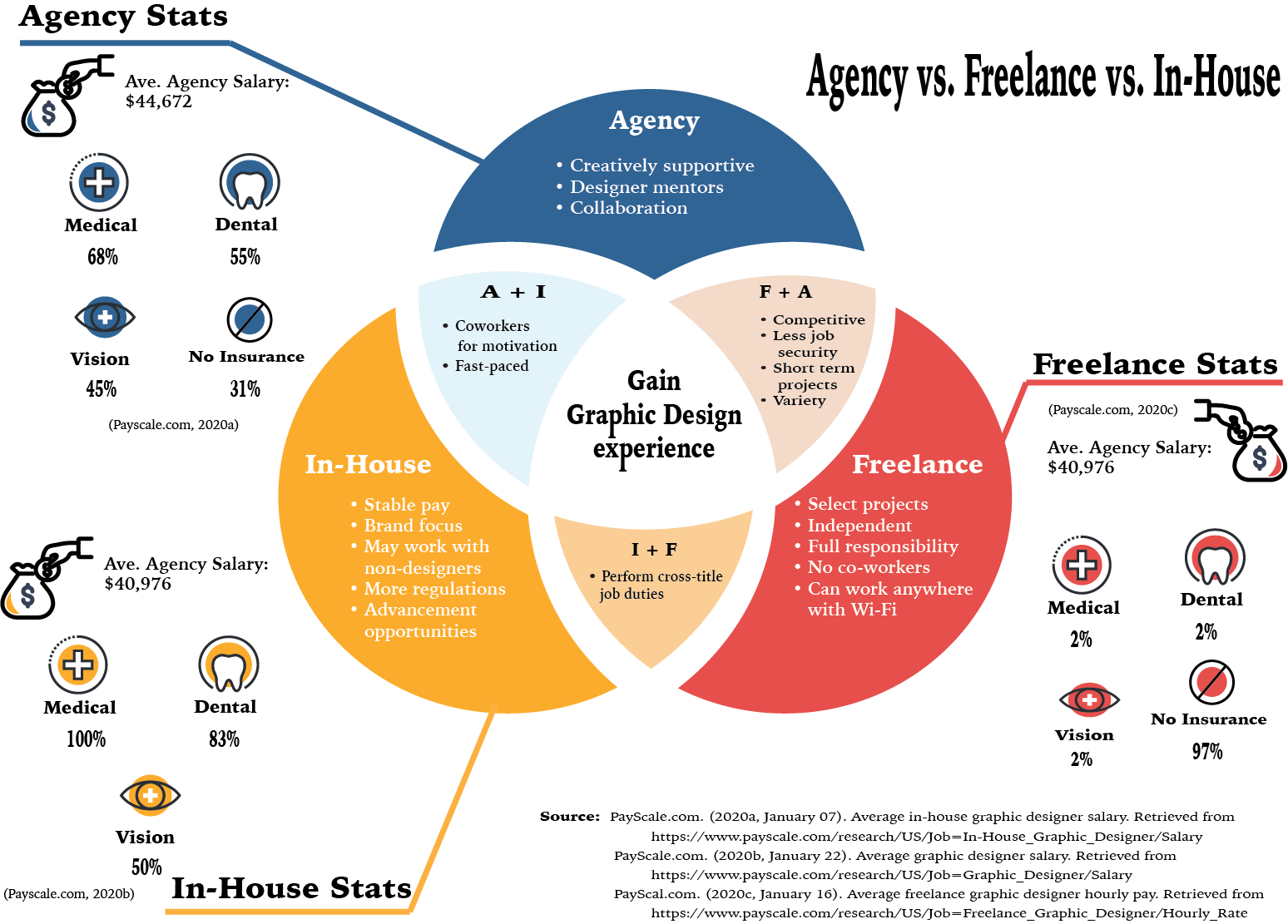
This week I learned a great deal about what kind of position I hope to obtain in the future. While I oten enjoy variety and freedom, I have found myself wanting more and more to have stability in my work life. This being said, I have some reservations about the day-to-day of the in-house designer. So using the readings from the week, I was able to create the infographic above that compares and contrasts the key elements identified about each job setting. I also felt it would be helpful to get an understanding of the average percentage of people with insurance in each setting.
For this infograph, I utilized Adobe Illustrator as it allowed me to create the cutout effect of the Venn diagram. After finishing the infographic, I feel that it could have been enhanced with shadows and other effects. However, this is still a great step toward improving my infographic design skills. My biggest challenge with this project was the color scheme. It was difficult to decide on a color scheme that I have not already utilized. Although I used color scheme generators such as Adobe Color and Khroma, I found myself gravitating to colors I often choose for my designs. To solve the monotony of my color selection, I had to challenge myself to create a color scheme of six rather than the five most generators offered. This helped break up the colors more than my original choices.
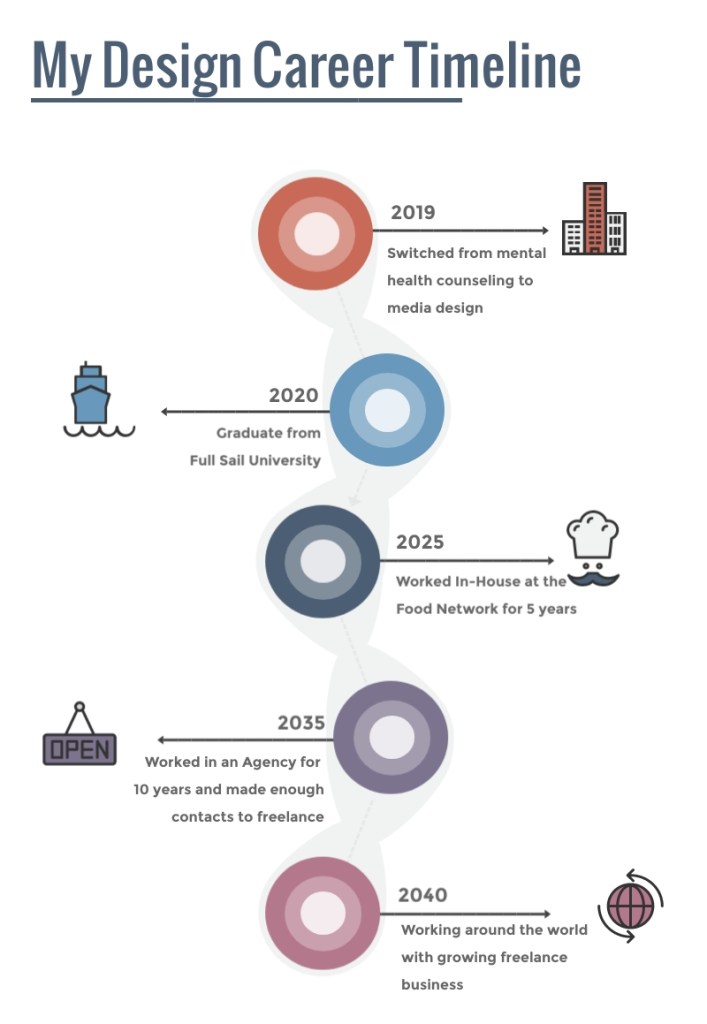
Lastly, I utilized Visme to develop my design career timeline. This site was easy to navigate and helpful in finding templates that make sense for the designer. Overall, the timeline was fun and easy to create as I was able to imagine what life could look like for me after the program.
Week 3 Design Challenge
In addition to the Mastery Journal task, I was also tasked with completing the Design Challenge to complete the Adobe Premiere Pro Beginner tutorials as well as a 30-second commercial. For this assignment, I struggled with technical difficulties, disruption of my regular study-week by travel, and difficulty with putting ideas onto “paper”. Despite all of these challenges, I was able to finish all of the required tutorials and develop a cohesive coffee commercial that was pretty cool, if I do say so myself.
Connecting, Synthesizing, Transforming
While completing the Design Challenge I looked up outside resources to help edit the music correctly for my 30-second commercial. However, the articles I found referred to editing music clips using software I did not have access to or could not afford. Instead, I continued playing around with the audio clip and the timing of the videos to improve the music. It was also helpful to pull up the After Effects tutorials from Week 2’s Design Challenge and rewatch the video on animating Adobe Illustrator vectors. This is how I was able to Fade In the logo at the end of the commercial. I also used information gained from the Adobe Premiere Pro tutorials to make sure the audio was playing at the same volume and to properly align the transitions. Both program tutorials were instrumental in completing my commercial.
Solving Problems
Initially, I worked on completing the Adobe Premiere Pro tutorials. These were fairly simple to follow along with as I had for the After Effects Design Challenge. However, I started noticing some of the video files downloaded from the site did not look the same as the presenter’s. In those moments, I would just open the files or import the sequence from a previous lesson to continue following along. It was not until I got to the Add Effects tutorial videos that the downloaded files were unavailable to be opened and received error messages. I tried watching the videos to see if I could just pull in a previously used sequence only to find the file used was complex. My other thought was to try opening the files in an older version of Premiere Pro which also did not work. After trying redownloading, I reached out to the professor.
With encouragement to either find a workaround or at least provide an explanation as to why we skipped those sections, I continued pondering my predicament. After a lot of thinking, I finally decided to just use old sequences from other videos when the presenter was just showing how to speed up a clip or something universal like that. The only time this would not work was when I was completing the final video of the last tutorial, Working with Clips. Thankfully, this video only needed to deal with the audio clips so choosing to open the file in ‘offline’ mode made it so that even though the pictures and videos didn’t show, the audio could still be edited.
Creating the 30-second commercial was presented with a different type of challenge. All of the video clips provided by Dr. Baldowski worked so I was able to scrub through each of them to get the idea of what they entailed. As I had already chosen to create a coffee commercial, I was especially interested in the clips that portrayed coffee-related material. At this, I remembered that Dr. Baldowski also posted a link to a Royalty-free music site and used that to search for the music to accompany my commercial. I had the idea that I wanted the commercial to be more epic and action-like than the traditional coffee commercial so finding the song “Evolution” by Bensound.com (n.d.) was perfect. The biggest difficulty was editing it to fit into the imagery that I put together. It took a lot of cutting, shifting and listening closely to get it as close as I could to hit at the right times.
Again, I used the Adobe Premiere Pro Tutorial Working with Clips to help fix the audio to make sure it didn’t blast the listener’s speakers. I also used Adobe Stock photos to find a coffee logo and the Robusta logo design fits well into the overall theme of the commercial as well as the name. As mentioned, I used the After Effects tutorials to animate the logo, making it fade from black and scale down to normal size. This was actually more difficult than I thought it would be and had to play around with the frames per second or fps of the composition to make it look the way I wanted. While the commercial can always be improved, I felt that from what I know of using Adobe Premiere Pro and After Effects, it was a great submission.
Innovative Thinking
I believe the approach I took to creating a coffee commercial that was more akin to an action movie teaser trailer was unique to the way most coffee commercials seem to be lighthearted and fuzzy. I thought it could be fun to try making a commercial that was something that would set itself apart from the types of coffee commercials that are typically portrayed on TV. For me, the success of the project was measured by its completion. This was another first for me and even though it took a while and I was unsure if I did things right, I was proud that I finished the commercial and it turned out the way I envisioned. The way the images cut in and fade out to the beat are my favorite parts of the commercial.
Acquiring Competencies
For this Design Challenge, learning to use the Premiere Pro tools more efficiently was a major part of finishing my commercial. It helped me to understand what I was doing and put the information learned during the tutorial challenge into action. It was also helpful learning certain hotkeys like if I decide to delete a clip from the middle of a sequence and I want the rest of the clips to slide into place, hold down the ‘alt’ or ‘option’ key while pressing ‘delete’. This was something that was imperative for me to know. Also, saving constantly during this process was important. I often needed to go back and forth between changes to compare what sounded best and what needed to be tweaked more. Saving has become almost second nature to me. Also having resources such as Bensound.com (n.d.) and After Effects are going to help me continue to develop my motion design skills, personally and professionally.
Concepts
Academic
- Time Management (technical): This past week was difficult as I had to travel and the hotel did not have Wi-Fi. It has been hard trying to get back in the flow of completing my assignments when I have to catch up. I consider this a technical skill because it must be put into practice to fully grasp how it can benefit your work.
- Static Infographic (conceptual): A static infographic uses a combination of still images and text to clarify various topics to viewers (CopyPress, 2016). It has been helpful in summarizing the information I learn each week and has helped me develop a new skill.
- Dynamic Infographic (conceptual): In contrast, a dynamic infographic, or interactive infographic, uses a combination of visual elements such as scrolling, clicking and videos to present more complex information or multiple solutions (CopyPress, 2016).
Conceptual
- Adobe Illustrator (technical): This program assists in presenting designs in web, print and illustration format. With it, I have been able to create artwork that is professional and more complex than anything that I could draw. It is technical as it requires the user to interactively change and manipulate the software to meet artistic needs.
- Adobe Premiere Pro (technical): Completing the Adobe Help tutorials opens up a new skill set for creating professional videos (Adobe, n.d.). This also requires a working knowledge of the software to create the imagery and is integral to most design-related positions today.
References:
Bensound.com. (n.d.). Evolution royalty-free music. Retrieved from https://www.bensound.com/royalty-free-music/track/evolution-epic-nature
CopyPress. (2016, August 4). Static infographics vs. interactive infographics: 6 questions to determine which one to create. Retrieved from https://www.copypress.com/blog/static-infographics-vs-interactive-infographics-6-questions/
Adobe. (n.d.). Adobe Premiere Pro tutorials. Retrieved from https://helpx.adobe.com/premiere-pro/tutorials.html
