In case you were unaware, there’s a pandemic happening and I’m still trying to figure out how to use Premiere Pro. It’s surreal. In other news, I got an #Jobternship working for Arsenal BJJ–a new Brazilian Jiu-Jitsu school that opened in my hometown, Huntsville, AL. I just finished my first album cover for Q. Cole Music–you can check it out here. And also, I’ve been trying my damndest not to lose my mind working in the house and still being productive.
Other than that, nothing much going on over here.
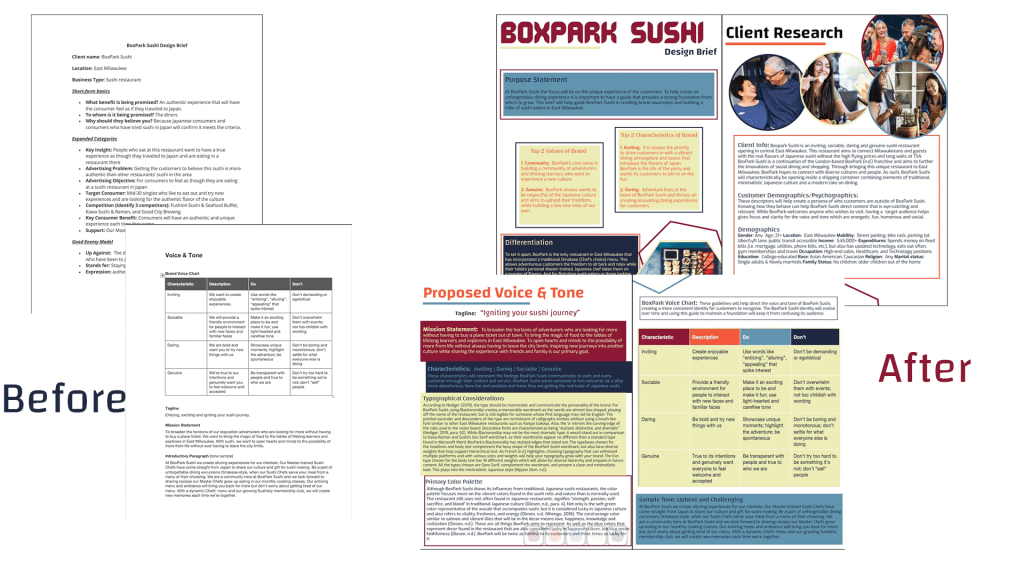
This month has been a steady solidifying of my fictional sushi restaurant, BoxPark Sushi. This assignment has been extremely frustrating because I’ve been craving sushi pretty much everyday and most of the places I would go are closed. Otherwise, it has been amazing seeing the step-by-step process of developing a brand concept and media plan.
Overview of the material and concepts learned this month
Connecting/Synthesizing/Transforming
Creating the finalized design brief required a lot of research. From using blogs and articles such as Olesen’s (n.d.) Color Meanings in Japan to develop my primary color palette and understand color theory to reading about what a media asset is and why it’s helpful from Anthem Branding (2017). To get to the final brief, I had to solidify BoxPark Sushi’s voice and tone. Completing the brand voice chart was the first step to finding out how BoxPark Sushi would present itself to its customers. Felton (2013) wrote that if your brand doesn’t have a brand book then you should write one, starting with the mission statement. The first thing I did was try to develop BoxPark Sushi’s mission which did not initially reflect what I wanted to say until I revised it during the final draft. I was too focused on being quirky that I missed the opportunity to really say what BoxPark Sushi represents. Bump (2019) noted that creating a successful design brief requires a “clear objective” (para. 1). For BoxPark Sushi, the design brief’s objective was to not onlt create a guide to focus the voice and tone of the brand while giving it a foundation to evolve from but connect people to another culture and the real taste of Japanese sushi. I just wasn’t sure how to articulate that at the time. Stukent Inc.’s (2018) guest speaker Liza Dunning also wrote about developing the ‘why’ of the brand and I finally understood that THAT was the brand’s mission statement. Dunning (as noted in Stukent Inc., 2018) used AirBnB’s and REI’s mission statements as examples of expressing a brand’s ‘why’ and it all made sense. While BoxPark Sushi’s mission statment can be quirky but it still needs to lay out a clear vision for the brand. With that, I rewrote BoxPark Sushi’s mission statement to reflect on being lifelong learners who appreciated exploring new cultures without having to leave their city limits.
Problem Solving
The design problem I had during this course was solidifying my primary color palette. I spent a lot of time developing the primary color palette by researching Japanese color meanings. I was so focused on identifying what certain color meant in Japanese culture that I didn’t think about restaurant color theory as much. Initially, the main thought was that this sushi restaurant should have a color palette with more than black, white and red (designer, 2013). However, this meant I came up with multiple colors that had a lot of meaning, but weren’t as cohesive.
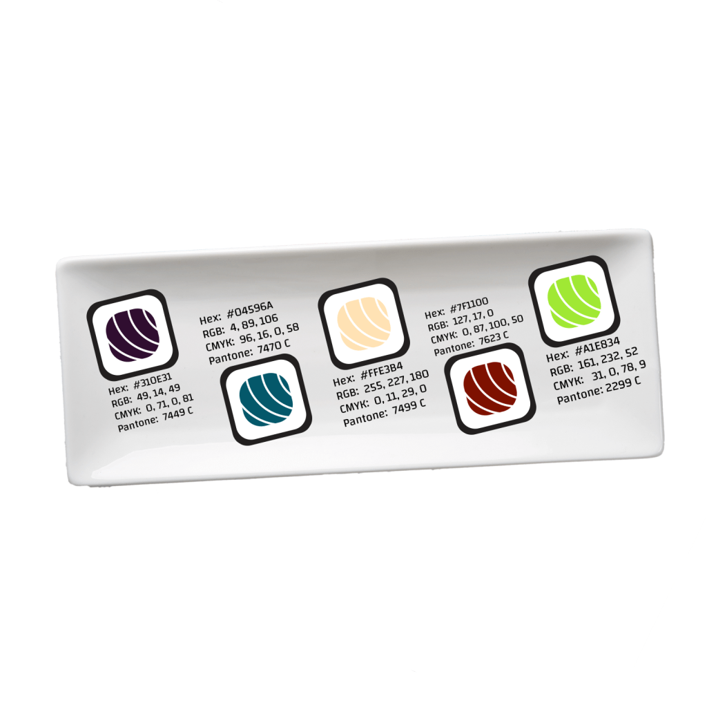
The colors were the differentiation I was looking for from other restaurants such as Kawa Ramen & Sushi (n.d.) and Kanpai Izakaya (n.d.), two of BoxPark Sushi’s direct competitors in East Side Milwaukee. Although I liked the colors individually and argued strongly that this color palette created a romantic feel due to its darker colors as noted by Traylor (n.d.), deep down it just didn’t sit well with me. Initially, I refused to change it, even when a critique I received confirmed my feelings of uncertainty about the color scheme (N. Osorio Donato, personal communication, March 26, 2020). I got all the way to the day the finalized version of my design brief was due before realizing that I was holding on to a design and trying to make it work despite my own thoughts about changing it. Once I realized I was selling the brand short by sticking to this color palette and was not living up to the brand’s own characteristic to be genuine, I knew I had to change.
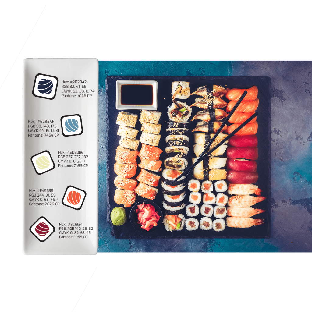
After Googling Japanese color themes and scrolling for what felt like forever, I finally turned to Adobe Stock photos and found the image above. I loved the way the sushi stuck out and was vibrant against the dark and sensual colors of the plate. Using Adobe Color, I extracted the colors that stood out the most and lined up with BoxPark Sushi’s personality. The new color palette still touches on the meaning of each color in the Japanese culture such as red meaning passion and strength while the orange means knowledge and love, the soft green meaning vitality and freshness, and the blues not only being one of Japan’s luckiest colors but also meaning faithfulness (Olesen, n.d.). It was important to the brand to think of what these colors meant in Japanese culture, but I still needed to keep in mind that Traylor (2016) cautioned against using blue in restaurants as it is said to reduce people’s appetites. However, knowing that blue is one of Japan’s luckiest colors, I felt it had to be a part of the theme. Overall, the final colors are more cohesive and almost creates a rainbow effect and who doesn’t like rainbows.
Innovative Thinking
The dynamic vision board prompted us to create what was essentially a promo video for BoxPark Sushi. For this assignment, my goal was to take the viewer on a journey as if they traveling to Japan to eat sushi. This video was a unique approach to showcasing what BoxPark Sushi will have to offer in comparison to its competitors with videos, Kawa Ramen and Sushi (as noted in Youcai Yang, 2018) and Fushimi (as noted in Youcai Yang, 2015).
Both restaurants focused on their decor along with food prep and presentation except that Fushimi (as noted in Youcai Yang, 2015) added customer testimonials in the end. Although their videos were professional and create the idea of wonderful meals in a nice setting, they did not display a unique representation of their restaurants. Without the logo and wordmarks appearing in their videos, it would be difficult to tell them apart. However, BoxPark Sushi could be recognized as the sushi restaurant with the planes in the commercial.
Acquiring Competencies
Academic
- Synthesis matrix (conceptual): This was a lifesaver when I was completing the Annoted Bibliography/Synthesis assignment. It made me realize how much simpler life can be if I take the time to identify the themes and a clear connection between articles.
- Brand voice chart (technical): Having the voice chart helped create a specific Do and Don’t list where I could identify down to the words the brand should and shouldn’t use.
- Media asset (conceptual): It took some time before I realized a media asset was the same as brand merchandise or promotional items. However, understanding how these can improve brand awareness is a big part of developing a media plan.
- Media plan (conceptual/technical): This term falls in both categories because it not only provides someone with a theoretical strategy for improving the brand but it also requires action to complete the steps. Knowing what steps to take are why it’s important to have an understanding of the media plan.
Occupational
- Design Brief (technical): I have already used the design brief on-the-job and it has helped to focus the type of content that is put out and acts as a foundation to most all posts and product plans
- Dynamic vision board (technical): Being able to show the client a realistic view of the plan can help with building the working relationship, but also help keep everyone on the same page
- Adobe InDesign (technical): I initially forgot how helpful IdDesign can be when creating an item intended for print. I struggled trying to create my brief in Word and get the 0.125″ margin required for print before remembering InDesign easily addresses that in the setup stage.
- Adobe Premiere Pro (technical): Creating the dynamic vision board would not have been possible without this video editor. It allowed me put together a cohesive video and make small adjustments as I went along.
- Adobe After Effects (technical): This program would have been more ideal for the ideas I had regarding animating text and transitions. I made the mistake of creating my dynamic vision board in Premeire Pro despite being stronger in After Effects. This has taught me to remember my strengths.
References:
Anthem Branding. (2017, December 6). Do’s & don’ts: How to make great brand merchandise. Medium. https://medium.com/swlh/dos-don-ts-how-to-make-great-brand-merchandise-dcd3a921507e
Bump, P. (2019, July 3). How to write a create brief in 7 simple steps [Examples + template]. HubSpot. https://blog.hubspot.com/marketing/creative-brief
designer. (2013, June 27). Modern take on a traditional Japanese style restaurant. DesignLike. https://designlike.com/new-contemporary-look-for-agora-swiss-night-hotel/
Felton, G. (2013). Advertising: Concept and Copy, 3rd Edition [VitalSource eBook version]. vbk://9780393733921
Kawa Ramen and Sushi. (n.d.). https://kawaramensushi.com
Kanpai Izakaya. (n.d.). https://www.kanpaimke.com
Olesen, J. (n.d.). Color meanings in Japan. Color Meanings. https://www.color-meanings.com/color-meanings-japan/
Stukent, Inc. (2018, May 17). Developing your brand voice- Liza Dunning [Video]. YouTube. https://www.youtube.com/watch?v=z9KRWgGYD8E
Traylor, R. (n.d.). How restaurant color schemes affect your customers. WebstaurantStore. https://www.webstaurantstore.com/blog/1884/interior-color-choices-and-your-restaurants-message.html
Youcai Yang. (2015, January 4). Fushimi restaurant commercial Milwaukee [Video]. YouTube. https://www.youtube.com/watch?v=T3_Ah7AcQUg&feature=emb_title
Youcai Yang. (2018, February 28). Kawa Ramen and Sushi Restaurant TVC [Video]. YouTube. https://www.youtube.com/watch?v=8Ukpk4AU7j0&feature=emb_title

One thought on “Month 8: Design Integration”