Despite running out of shows to watch, learning to design a portfolio in Webflow (it’s a work in progress), finishing the concept art for an artist’s EP–check it out here, trying to pick back up learning French, running out of laundry to wash and things to clean, I have found that my ability to concentrate on important things like homework is quite difficult. However, I was able to finish Month 9 with my brand guide and my sanity (somewhat) in tact. And just in time for me to start a new job tomorrow!
So to kick off my last night of not having to wonder how many different ways I may have just contracted Miss Rona, I’m going to tell you about how month 9 of the program went!
Overview of the material and concepts learned this month
Connecting/Synthesizing/Transforming
A large part of this month focused on logo and media asset creation. As it we move closer to finishing our BoxPark Sushi concepts, we are finalizing the brand’s personality and were tasked with creating physical representations of its identity. For this version of BoxPark Sushi, the focus has generally been on the preparation of sushi in the traditional manner performed by Japan-trained chefs and creating a social restaurant built around engaging activities and memberships. The question was how to find a logo that would represent these two visions.
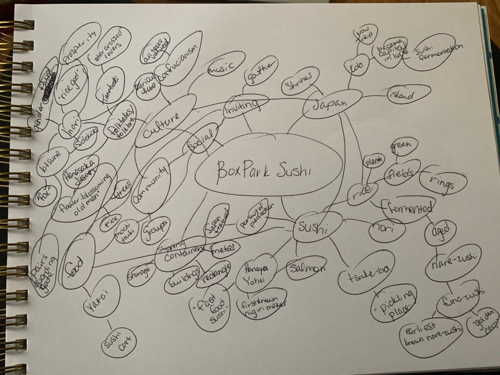
Using Airey’s (2013) directives to make a simple, relevant, enduring etc. logo, I created a mind map of pretty much anything I knew about Japan and sushi off the top of my head. When I hit a road block, I began my research using what I had and allowed it to inform new directions to broaden my knowledge-base. My overall goal was to create something relevant that spoke to the traditions of Japan without appropriating or being tone deaf to the culture. Pncadmin (2017) acknowledged that when creating a logo, culture can have a significant impact on the acceptance of the company and can even go as far as destroying the brand before it even launches. Colors, symbolism and design represent different things in various cultures and while we may not be able to foresee them all, taking the time to be aware may minimize negative consequences (Leow, 2017; pncadmin, 2017). Although I’ve grown up watching anime and have dreamed of going to Japan, I knew I was no expert of the nuances of Japanese culture.
According to Commisceo Global (n.d.), traditions are very important to Japanese culture and one of those traditions is the Shinto religion that is indiginous to Japan. This religion, still practiced today by at least 60 million pople, highlights the kami, or divine spirits, who roamed the Earth (Commisceo Global, 2015). There are gods and goddesses who represent aspects of nature. To this day, there are several nationa festivals, rituals, and practices in Japan that specifically honor Shinto deities (Commisceo Global, 2015). My search led to Inari/Oinari, god/dess of rice, prosperity and love, who was represented as both male and female throughout history and has conflicting views of the deity’s character (Yoose, n.d.). Following this path, satisfied Airey’s (2013) suggestion that a logo also be based in tradition.
Through more research, I found that Inari/Oinari is one of the most recognized Shinto dieties, with one in every three shrines in Japan dedicated to the deity, and is often represented as either an “old man sitting on a pile of rice with two foxes beside him, or of a beautiful fox-woman” (Yoose, n.d., para.2). It was interesting that regardless of the representation, Inari/Oinari was often associated with kitsune, or fox spirits, who act as guardians and messengers of the deity. There are only theories as to why the fox is associated with the deity but living foxes are known to roam the rice fields in the growing season and eat rodents that would normally eat the rice (Yoose, n.d.). Kitsune are also widely seen throughout Japan as guardians to Inari shrines (Jamieson, 2018; Yoose, n.d.).
Using this idea of the Kitsune, or fox spirit, acting as a guardian of the rice at BoxPark Sushi and Inari/Oinari’s blessings of rice and prosperity, I began creating iterations of the logo.
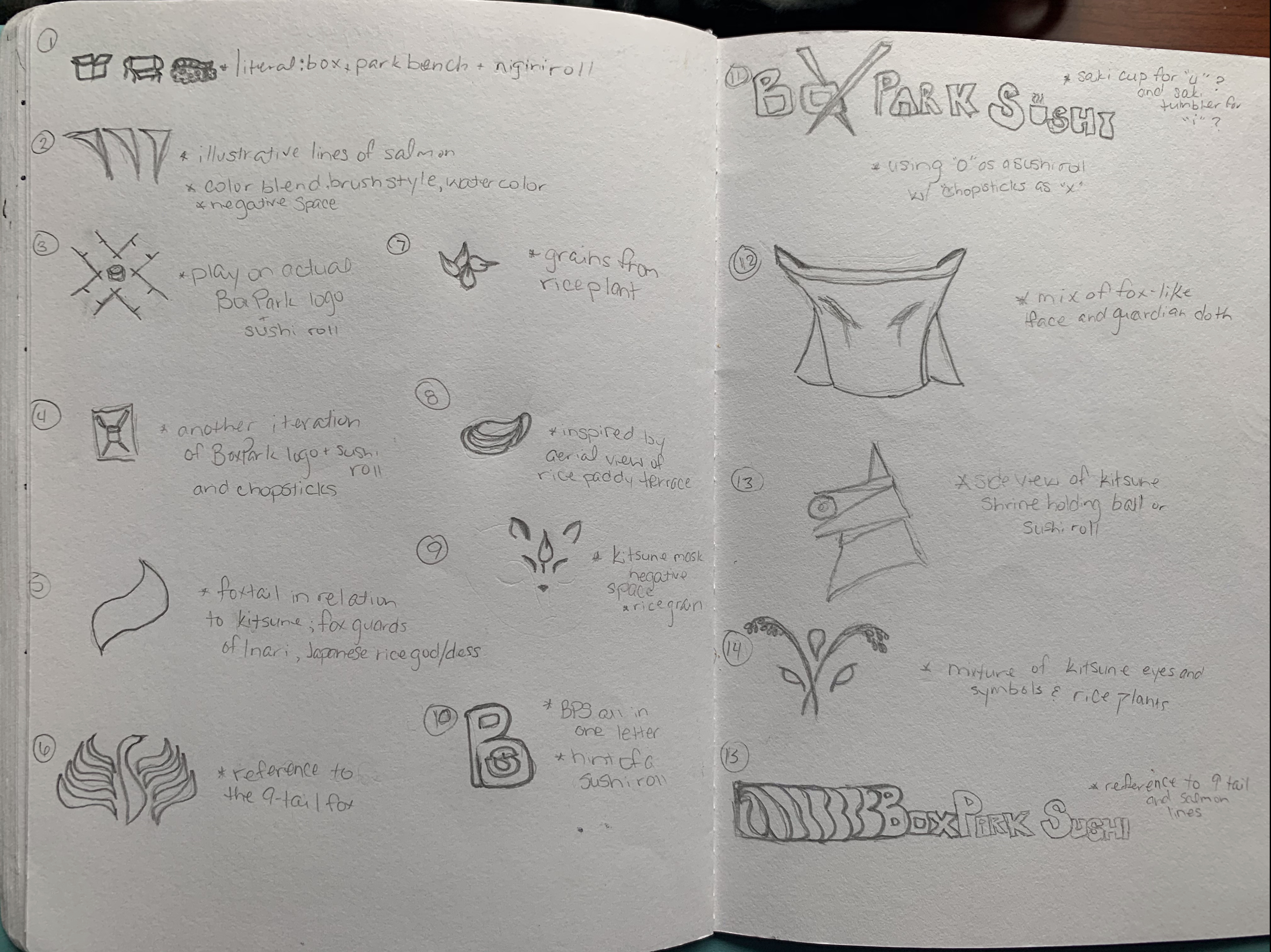
Through logo refinements and critiques about the relevance, design, and possibilities of the presented sketches, I was able to narrow down the possible logos to three iterations.
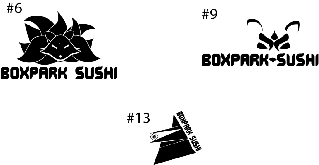
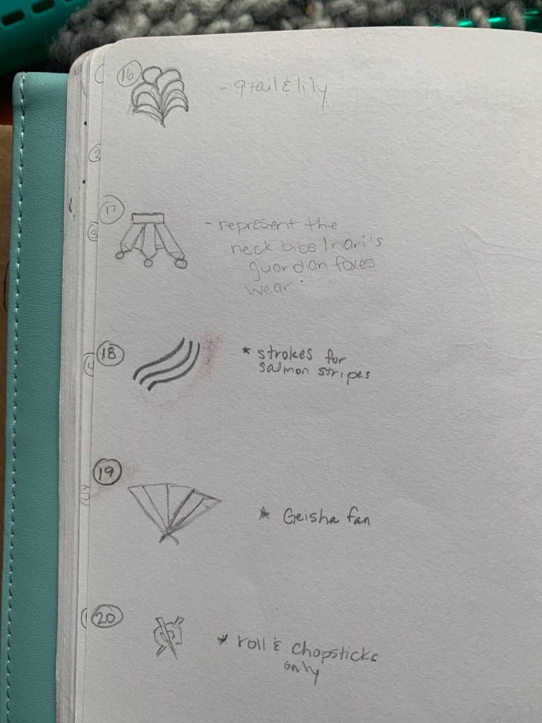
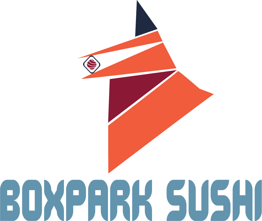
Using Airey’s (2013) guidelines to creating logos, these three presented the most possibility to be scalable, distinct, were based in tradition, memorable, and could stand the test of time. The practicality of each prospect was taken into consideration, but #13, the geometric representation of a kitsune statue with its traditional red bib was the most distinct of the three. After further refinement and applying the color palette, this version of BoxPark Sushi’s logo was presented. Interestingly, not only were red and orange, already a part of my color palette, it was noted in Loew (2017) that orange is one of the only colors that does not have a negative connotation across cultures and red in Japanese culture denotes strenth, passion, and self-sacrifice (Oleson, n.d.). Although Inari/Oinari foxes are often depicted as all white, using the orange in the color palette not only allowed for a universally acceptable color, but also played more to the traditional representation of foxes.
Problem Solving
The design problem arose when considering how to make it easier for people wanting direct access to BoxPark Sushi’s menu, calendar, and operating status. The Boxpark Sushi app user-friendly as well as on-brand with the other assets. Originally, the design incorporated a simple user interface that made it easy to navigate for younger and older customers intending to order food for pickup, make reservations, check their membership status or sign up for a class. However, the colors were and layout were inconsistent with the rest of the assets.
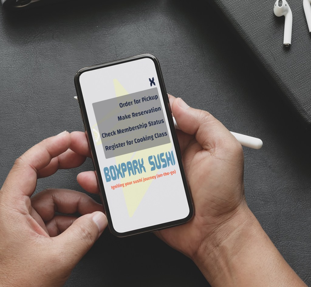
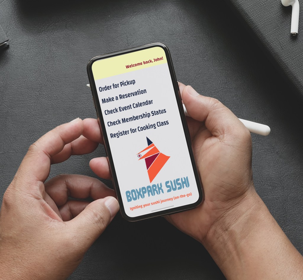
In addition to the inconsistency of the icon’s appearance, the use of the menu was deemed unnecessary as the app would only be able to perform those activities. Professor Argo (2020) challenged us to stop hiding behind menu boxes and allow the app options to exist in their own right. With that in mind and the decision to personalize the app by adding the customer’s name in the top right corner, the updated version of the app looked more welcoming and still easy to navigate for the tech-challenged.
Innovative Thinking
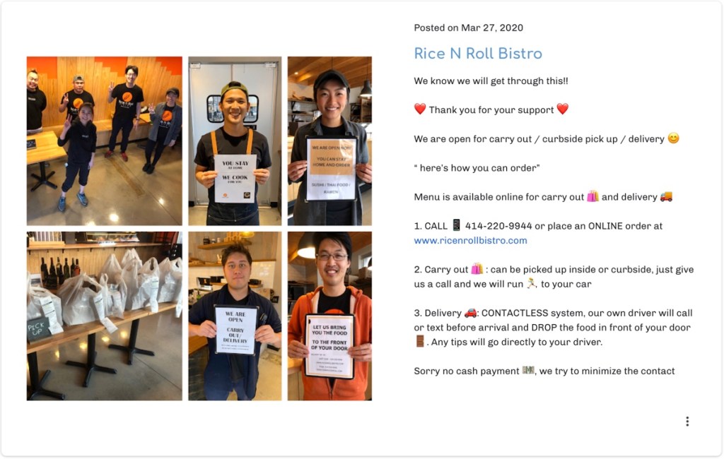
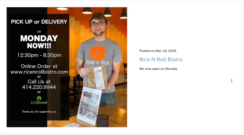
Overall, the design of the carryout bag was innovative in comparison to what is commonly used in restaurants. Typically, a restaurant carryout bag is either similar to a grocery bag or a blank paper bag such as the ones Rice N Roll Bistro (n.d.), a sushi restaurant in East Side Milwaukee, uses. This is a typical industry standard.
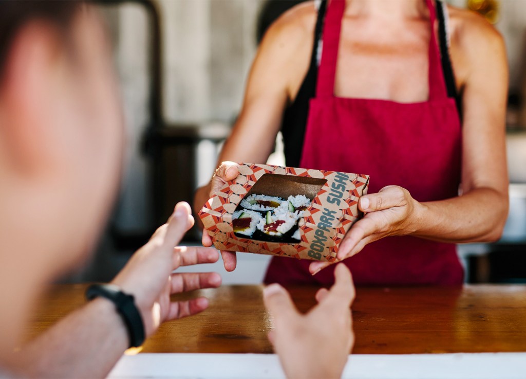
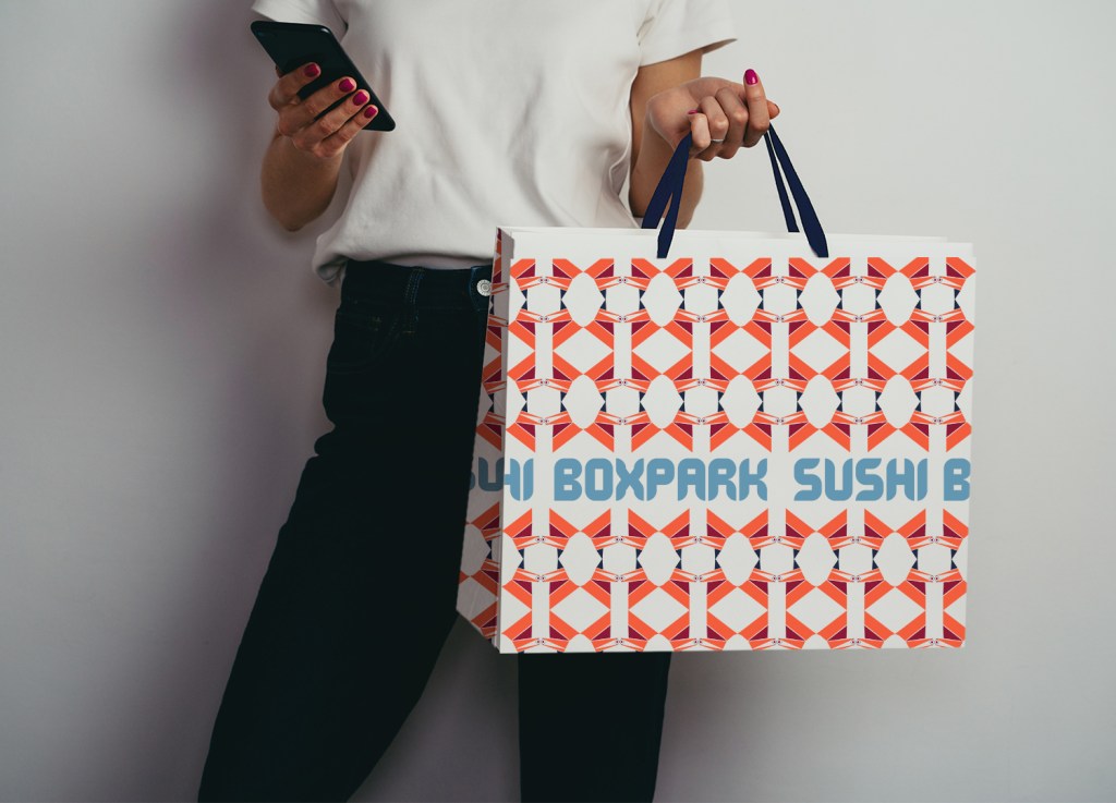
Anthem Branding (2017) advises creating media assets than can be incorporated in customers’ daily lives. Having a convenient way to transport food home is nice, but then being able to reuse that bag to carry lunch the next day or two is more useful and it doesn’t hurt of the design is visually appealing. In addition to helping the customer find a environmentally safe way to carry food, it can also help spread awareness of BoxPark Sushi. According to Piletics (2017), reusable carryout bags and boxes are considered Australia’s third favorite media asset. The bag and box for BoxPark Sushi use a repeated pattern of the Kitsune icon to created dynamic shapes and visuals. This will make the carryouts stand out if taken to work or events. The name BoxPark Sushi is also printed repeatedly in a cutout section of the bag on all sides making it easier for someone to see where the customer got the bag without having to ask (in case they’re shy). The box also displays the restaurants name on the side, making it easily identifiable as well. Both items are recyclable and the bag is reinforced at the bottom to make sure food stays upright and deter leaks, making it reusable. This concept could be strengthened if BoxPark Sushi club members were given an insulated carryout bag upon joining or a tote with a reinforced bottom. These simple items are a first step to reaching new customers and building new relationships.
Acquiring Competencies
Academic
- Rationale (concept)
- Design Problem (concept)
- Clear Space (technical)
- Logo Configurations (technical)
- Brand Consistency (concept)
Occupational
- Retrospective (concept/technical)
- Brand Guide (technical)
- Adobe Dimension (technical)
- Product Mockup (technical)
- Design Layout (technical)
In case you missed the link above, here’s a look at my brand guide!
References:
Airey, D. (2014). Chapter 3: Elements of iconic design. In D. Airey (Ed.), Logo design love: Annotated and expanded, 2nd ed. [eBook edition], Peachpit Press. https://learning.oreilly.com/library/view/logo-design-love/9780133812589/ch03.html
Argo, B. (2020, April 30). M9W4th043020 [Video]. Zoom. https://fullsail.zoom.us/rec/share/1O5OAo_qqzlLTKPp6EriArMRI6fIeaa82iNL_vRZmB2_X2vDEO08syCHKguiJdov?startTime=1588262785000
Commisceo Global. (n.d.). こんにちは (Hello!) and welcome to our guide to Japanese culture, customs, business practices & etiquette. https://www.commisceo-global.com/resources/country-guides/japan-guide
Commisceo Global. (2015, August 1). A brief introduction to Shinto. https://www.commisceo-global.com/blog/a-brief-introduction-to-shinto
Jamieson, A. (2018, June 12). 6 things you should know about the Inari fox in Japanese folklore. Japan Objects. https://japanobjects.com/features/kitsune
Leow, M. (2017, March 2). How cultural differences play into the final designs of logos. DesignTaxi. https://designtaxi.com/news/391225/How-Cultural-Differences-Play-Into-The-Final-Designs-Of-Logos/
pncadmin. (2017, May 15). How can a culture impact a logo design?. PNCLogos. https://www.pnclogos.com/can-culture-impact-logo-design/
Olesen, J. (n.d.). Color meanings in Japan. Color Meanings. https://www.color-meanings.com/color-meanings-japan/
Rice N Roll Bistro. (n.d.). https://rice-n-roll-bistro.business.site
Yoose, B. (n.d.). INARI or Oinari or Oinari-sama. Onmark Productions. http://www.onmarkproductions.com/html/fox-inari-university-of-wiscon.htm

One thought on “Month 9: Multi-Platform Delivery”